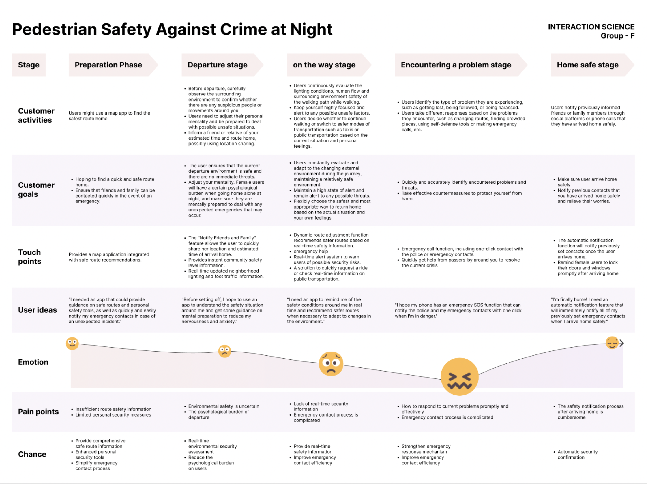
Pedestrian Safety
Interaction Science for Pedestrian Safety at Night
Night-time navigation solutions against fatal crimes in London, UK
Introduction
The chosen topic focuses on the problem of navigating in the context of fatal/life-threatening street crimes against pedestrians/commuters, primarily at night. London has an increasing rate of violent street crimes (Overton, 2023) and people don’t trust authorities (Personal security). Women were found to be more affected by this issue, creating a huge impact on their daily lives.
Personal security/safety is essential, through a preventative lens.
While several solutions try to address this problem, a lack of reliable real-time data to inform safe pedestrian routes was discovered. Here, an exploration of real-time population data was explored to inform safer pedestrian routes.
A review of relevant HCI studies/papers relevant to navigation showed:-
- Visual navigation using smartphones can interfere with pedestrian safety
- AR solutions at night would require specific visual calibration
- AR smartphones would be impractical for navigation
- Voice-assisted navigation may be considered safer
- Haptic feedback can be used to create attentive navigation
After further research and conceptual exploration, a solution that considered navigation through the lens of consolidated safety data gathered from municipal sources, infrastructure, and users was arrived at for further design.
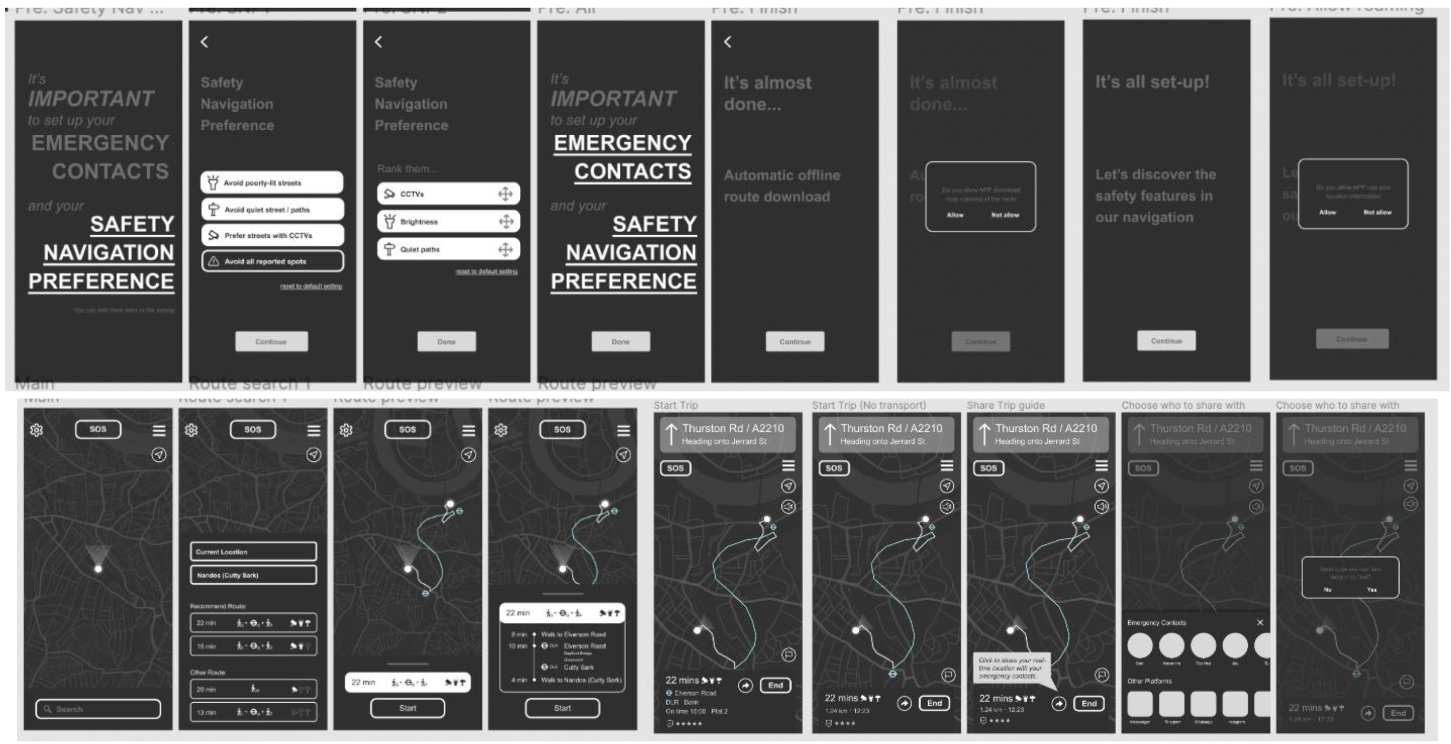
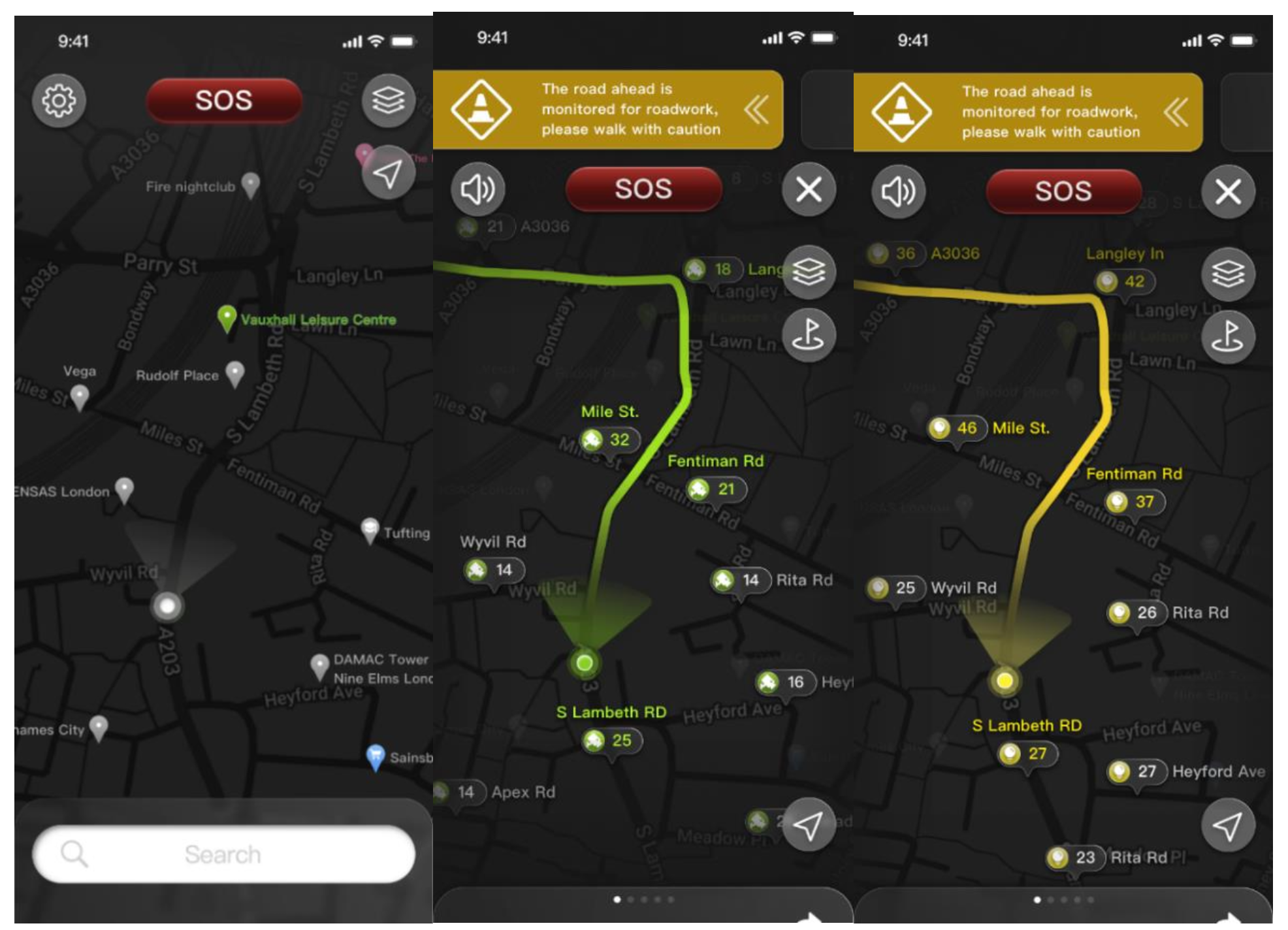
2. Interaction Design Prototype
2.1 Instructions for prototype
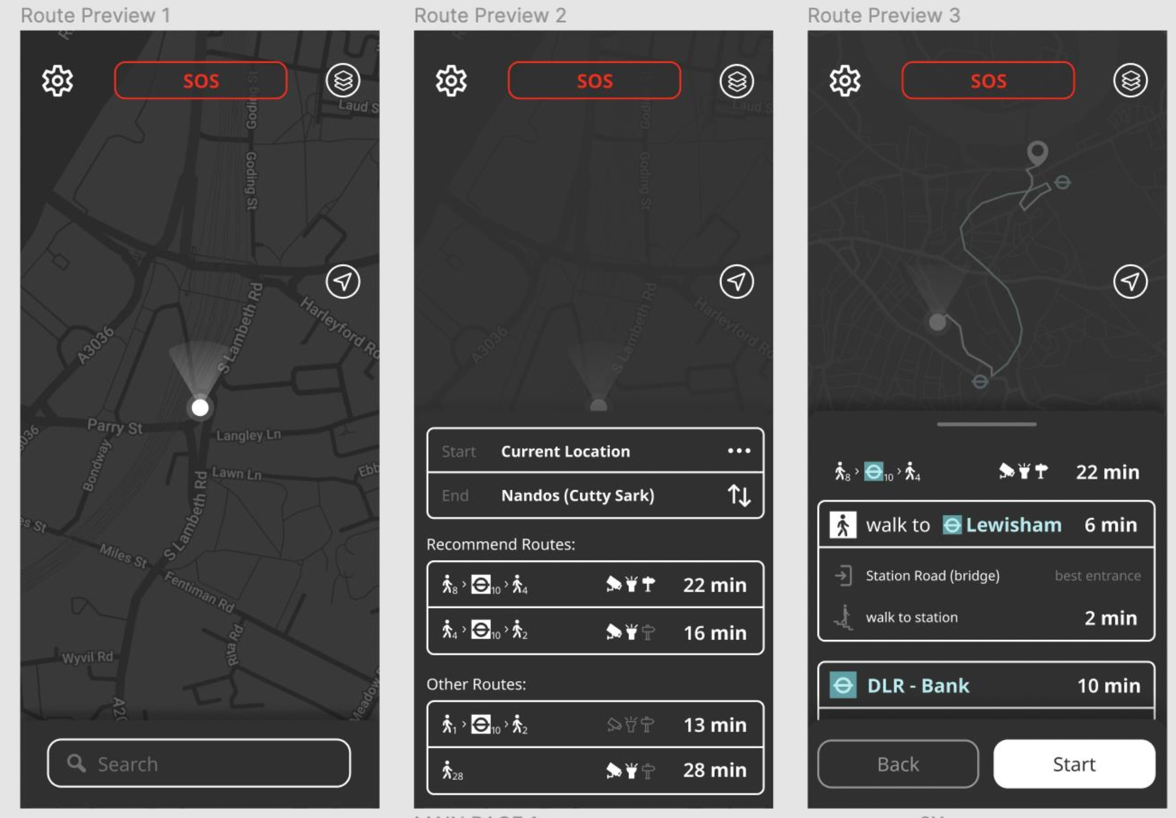
Title
Safe Home – Pedestrian Safety App
1. Search Bar
(tap on the search bar)
Upon opening the app, the user will have to tap on the search bar at the bottom of the screen. This is to enter the navigation screen of the service.
2. Navigation Screen
(Tap on the 1st recommended route)
After entering the navigation screen the user will be presented with input options for start and end journey. The users will also see recommended routes and other preferable routes.
Happy Path: The user successfully selects the preferred path for his navigation.
3. Start route
(Tap on the start button)
Upon clicking on the preferable route, the user will see a summary display of the chosen route. Clicking start will take the app to the live navigation mode.
Happy path: The user successfully enters the navigation details and is ready to start the journey.
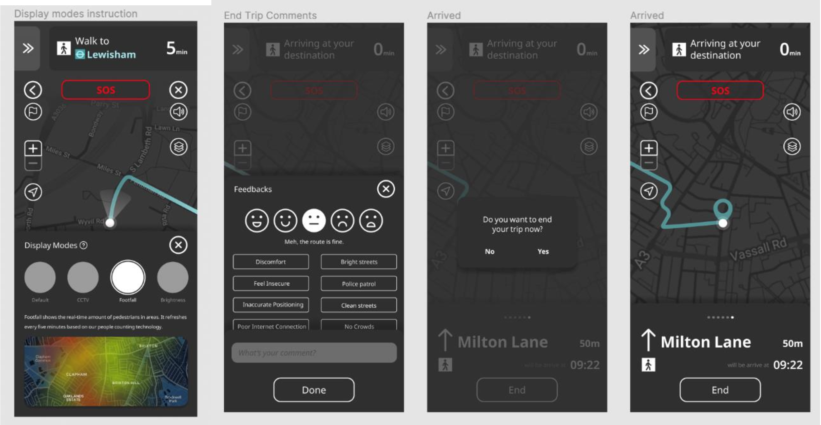
4. Live Navigation
The live navigation screen presents the user with Mutiple options
(Tap on the back icon, zoom in or zoom out, current location, Side instructions, Activate voice navigation, display modes, End trip)
Happy path: The user is successfully able to use the various live navigation functions as part of accessibility features includes the various travel display modes.
2.2 Design Process & Thinking
For the overall design process, the well-known methodology developed by the Design Council in 2005 called the double “diamond approach” was followed. This design approach is based on and incorporates a product-centric design process (Stephen J. Clune, Simon Lockrey, 2014).
Within the ‘Develop’ phase a lean UX design model was followed to iteratively design prototypes.
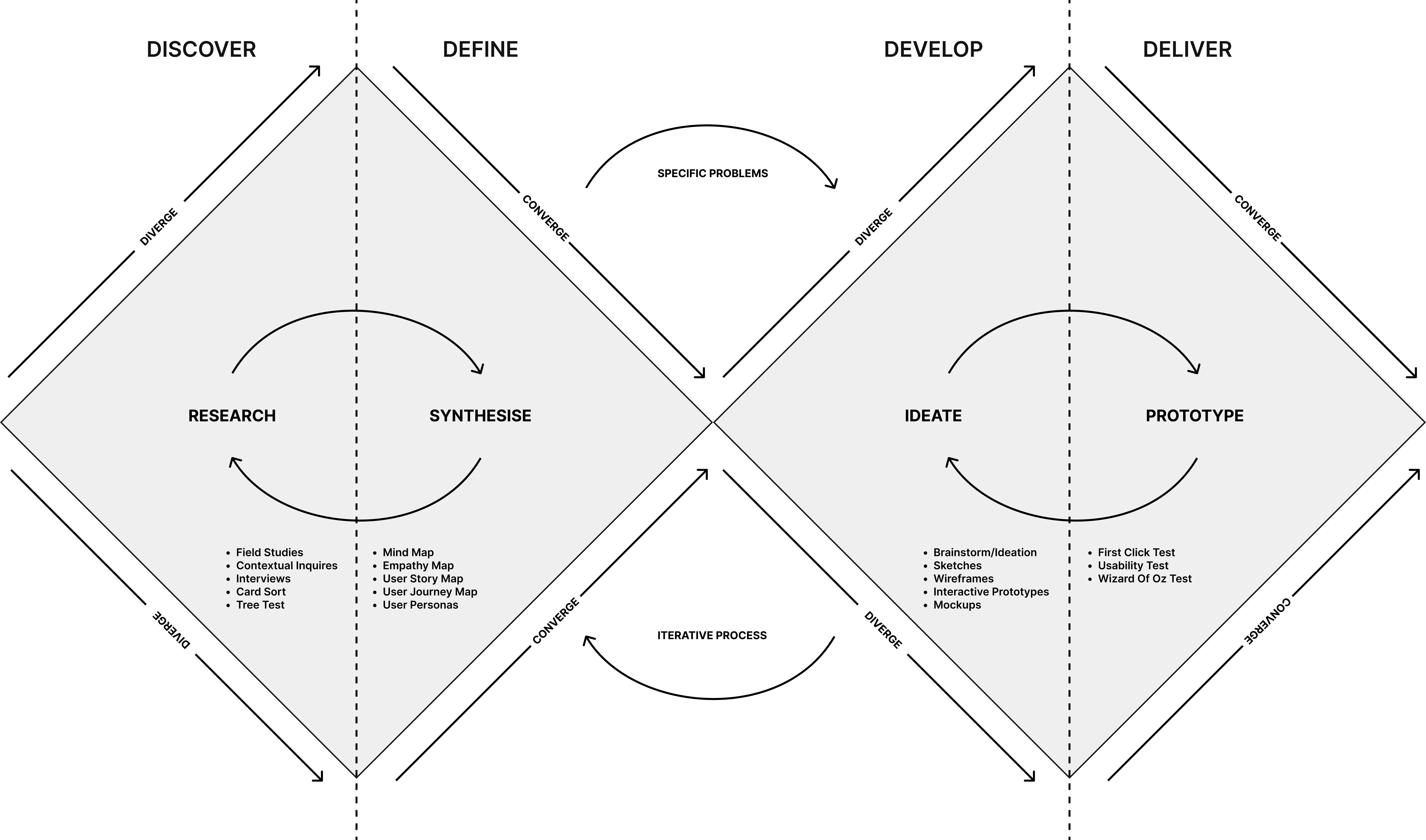
Fig. 1: The Double Diamond UX Design Process
Source: https://informatics.nic.in/uploads/pdfs/e9eed640_34_35_tu_double.pdf
The design approach was divided into four phases: discover, define, develop, and deliver. In each phase user input through various validation and testing methods was collected to inform the solution. Concept selection and validation were based on user needs and interaction design principles studied from well-known sources such as Nielsen Norman Group and Interaction design foundation.
Within the ‘Develop’ phase a lean UX design model was followed to iteratively design prototypes.
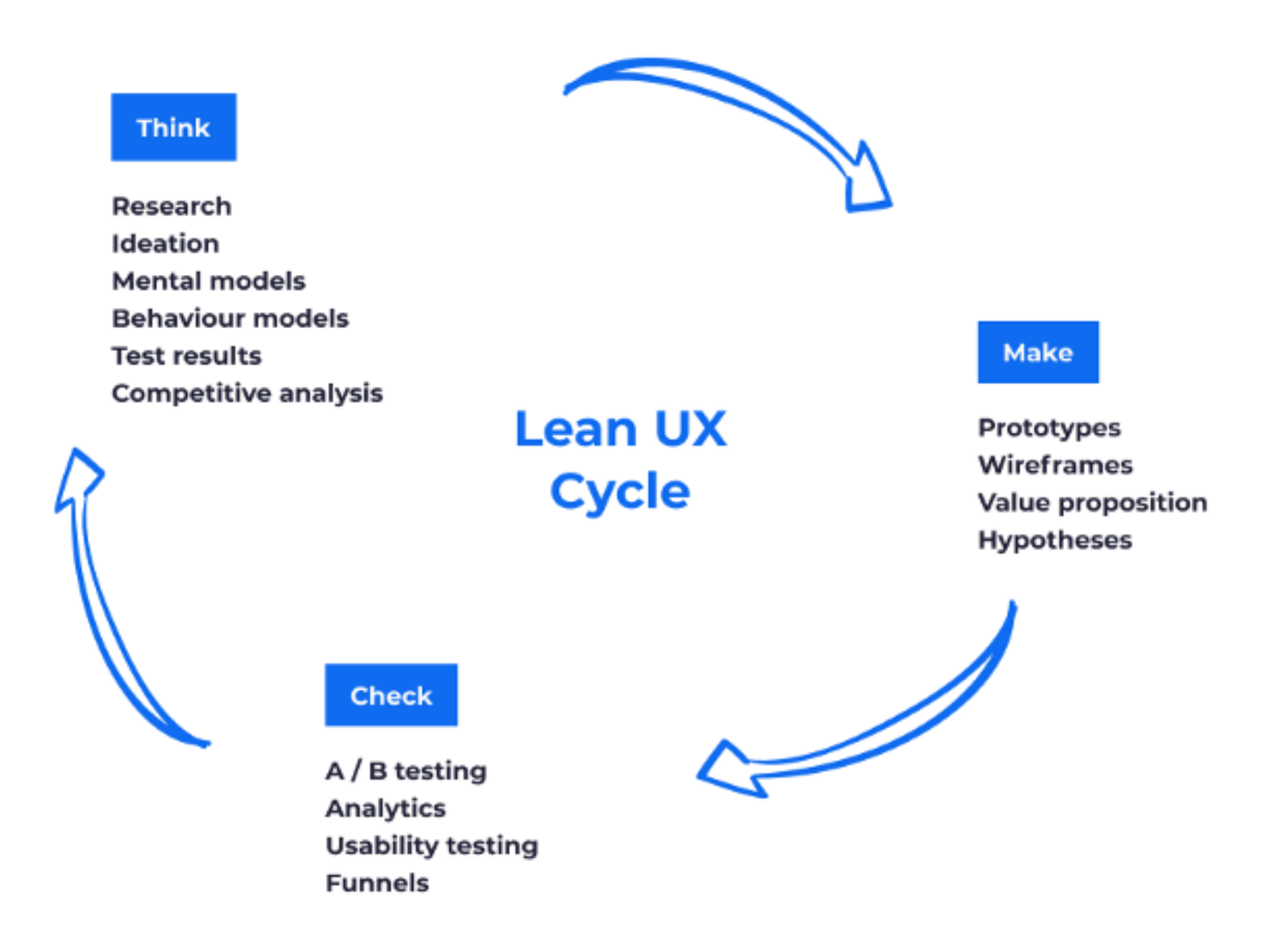
Source: https://www.plainconcepts.com/lean-ux-methodology/
Our research objective
- Finding problems related to pedestrian safety on the streets of London.
- Identifying the technological landscape when it comes to pedestrian safety.
Our research questions
- How can pedestrian safety be addressed for everyday commuters in the UK?
- Understanding and identifying behaviours and attitudes about safety concerns from the lens of pedestrians.
- The use case of current technology solutions that people use as part of safety procedures.
2.3 Discover
The ‘Discover’ phase included reviewing insights from the literature review, a competitor analysis, and primary research to understand user perceptions of safety, pain points and attitudes towards potential solutions.
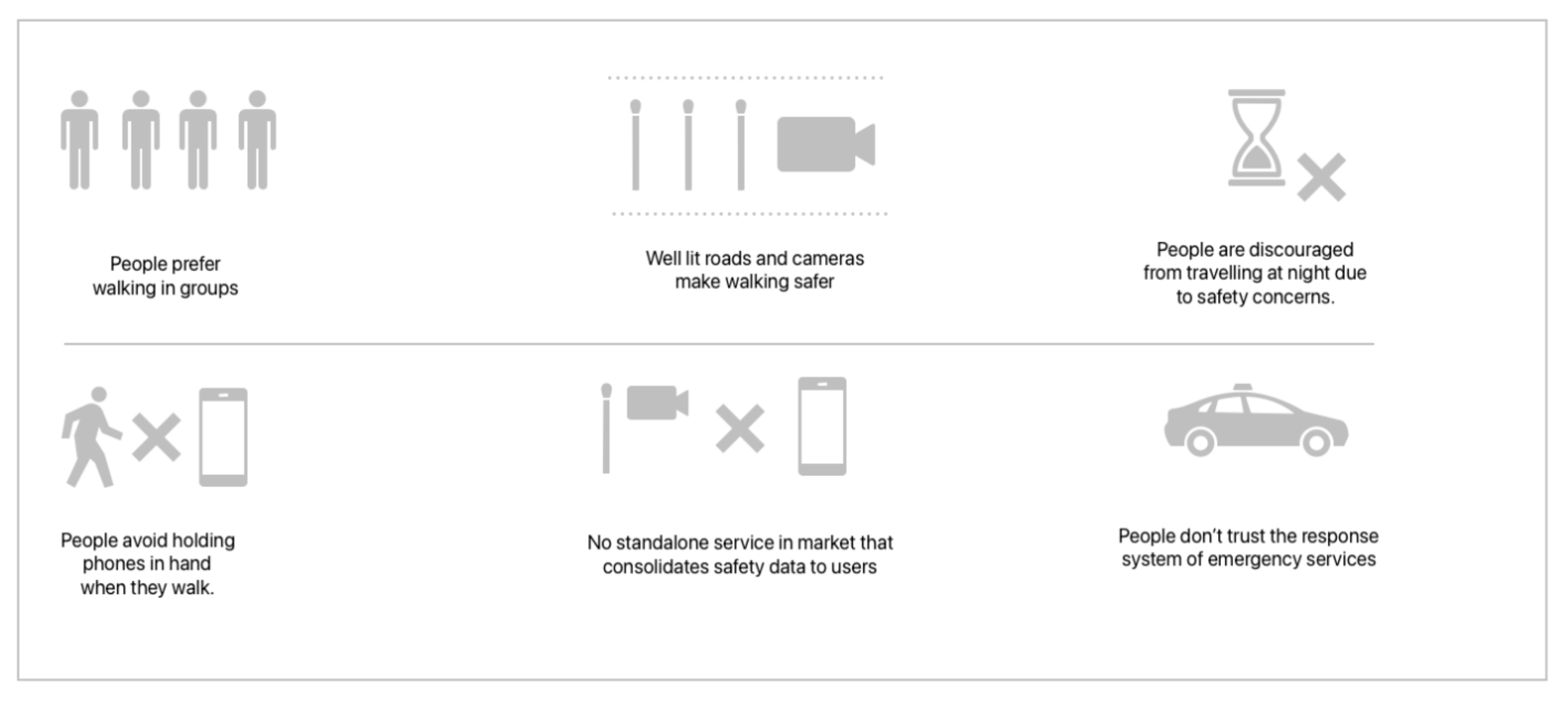
Literature Review—Key Insights
- 70% of those who felt unsafe stopped traveling at certain times of the day and 55% found it difficult to report a crime to the police
- Lack of connectivity is an issue in the underground travelling scenario
- One of two women in the UK show concerns for their safety while walking at night
- Women tend to walk alone at night in well-lit and busy areas to reduce fear
Context and the Problem
London, like many big cities, is home to an array of different types of crimes with in increase in street crimes (London’s Street Crime Epidemic: Moped Gangs, Acid Attacks, no date) Data from the Met Police shows an overall increase in knife crime and hate crime between 2020 and 2024 and the rate of muggings in the west end has tripled in the last two years with moped and e-bike gangs involved in these activities (Tingle, 2024).
According to a study by the London Travelwatch in 2021, concerns for personal safety while commuting emerged as an important issue—it was found the younger commuters (18-37) compared to older ones and women and other genders compared to men were more likely to feel unsafe while using mixed public transport. 28% of women were found to be primarily concerned about sexual harassment while walking and 1 in 4 women had experienced unwanted sexual behaviour in the last 3 years. It was also found that 70% of those who felt unsafe stopped travelling at certain times of the day and about 55% found it difficult and taxing to report a crime to the police. A lack of connectivity was also an issue in the underground (Personal security, no date). There are numerous reports and censuses that reveal the same issue. According to Official of National Statistics (ONS) census in 2021, one out of two women in the UK shows concerns for their safety while walking down the street alone in their local area after dark, especially in open spaces, where four out of five women feel unsafe (2021). The guardian reports that women tend to walk alone at night in well-lit and busy areas to reduce fear. The insecurity of going home is daily and real (Obordo and Otte, 2021).
Field study and Contextual Inquiry (see details in Appendix A)
The field studies and contextual inquiries were conducted in Lewisham during the day and at night.
Field studies: Key observations—
- People generally walk fast when they are alone.
- People often wear earphones/headsets while walking
- People are more wary of other pedestrians at night
- People are often carrying many bags or items while walking
- Most people have their phones kept away
- Pedestrians prefer walking in well-lit areas at night
- Pedestrians walk faster at night
Contextual Inquiry: Key Insights—
- Women don’t like to carry phones in bags for fear of theft
- Most users prefer using phones for navigation
- Rain and cold makes it hard to use the phone
- Some women, new to London do not go out at night at all
- Users hold their bags tight for fear of theft
- Most women prefer taking well-lit and familiar routes
Semi-structured Interviews (see details in Appendix B)
Participants were recruited by message among peer groups inside and outside Goldsmiths University for interviews to gain further insight into the problem space.
Semi-structured Interviews—Key Insights
- Users did not like to keep their phones out while navigating at night and were comfortable using voice-assisted navigation.
- Voice assisted navigation was sometimes confusing due to the lag
- Users could not estimate distances through navigation (i.e. users did not spatially understand the measure of distance as currently shown in Google Maps)
- One of the most significant factors in determining whether a user would walk on a street at night with lighting conditions.
- Users often took additional precautions such as turning off music, holding objects that might help defend themselves.
- Having someone aware of their location and waiting for them to arrive made them feel safer
- Users did not believe that they would feel confident navigating using haptic feedback alone and feared the learning curve that would distract them and cause stress
Competitive review
A competitive review of the existing products/services in the market was conducted focusing on problem solving and the use of technology. The app functions were analysed to understand what the competitors have been offering as part of their safety suite to users.
Competitive and Technical Review
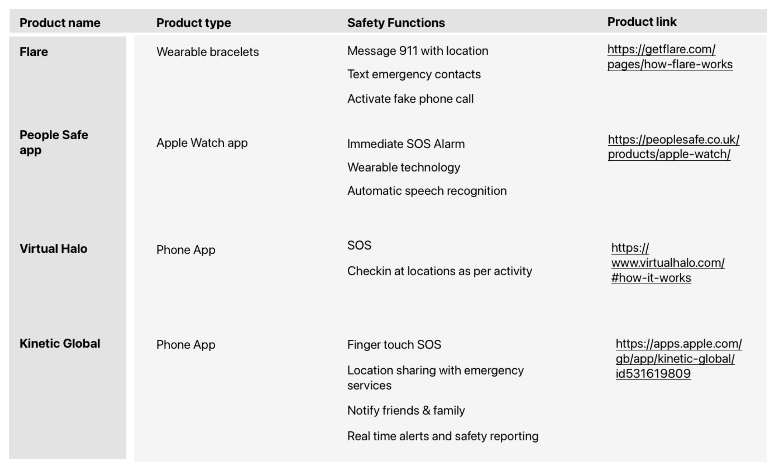
There are existing solutions to address the issue of women’s walking safety at night in the UK. Physical solutions include municipal infrastructures and products that serve as a quick way to respond to an emergency and report danger, whereas digital solutions are websites for self-informed safety check, and mobile applications for walking route plotting and tracking.
While these can be effective ways to tackle the issue most of these solutions are not preventative but rather a response to incidents. Preventive applications on route guidance do not use real-time metrics for decision-making, something that we hope to achieve in designing our solution. For details on different types of solutions please see Appendix B.
In terms of counting people, there are two broad approaches—using data from individual devices and infrastructural development of people counting technologies. We propose to use infrastructure as the use of individual data may lead to easy deception from perpetrators regularly engaged in street crime. Several footfall sensor technologies for outdoor application are systematically studied by TrailGazers EU—the possible technologies could be Camera/3D Based Visual Sensors which can be privacy compliant (GDPR) through the data management system, Wi-Fi/BLE Device Monitor ‘Sniffer’, Radar (Doppler) Sensor, Pyro (Thermal) Sensor, Passive Infra-Red (PIR) Sensor, and Pressure Slab. Picture below shows the suggested decision chart when considering sensor technology (Madden et al., 2021).
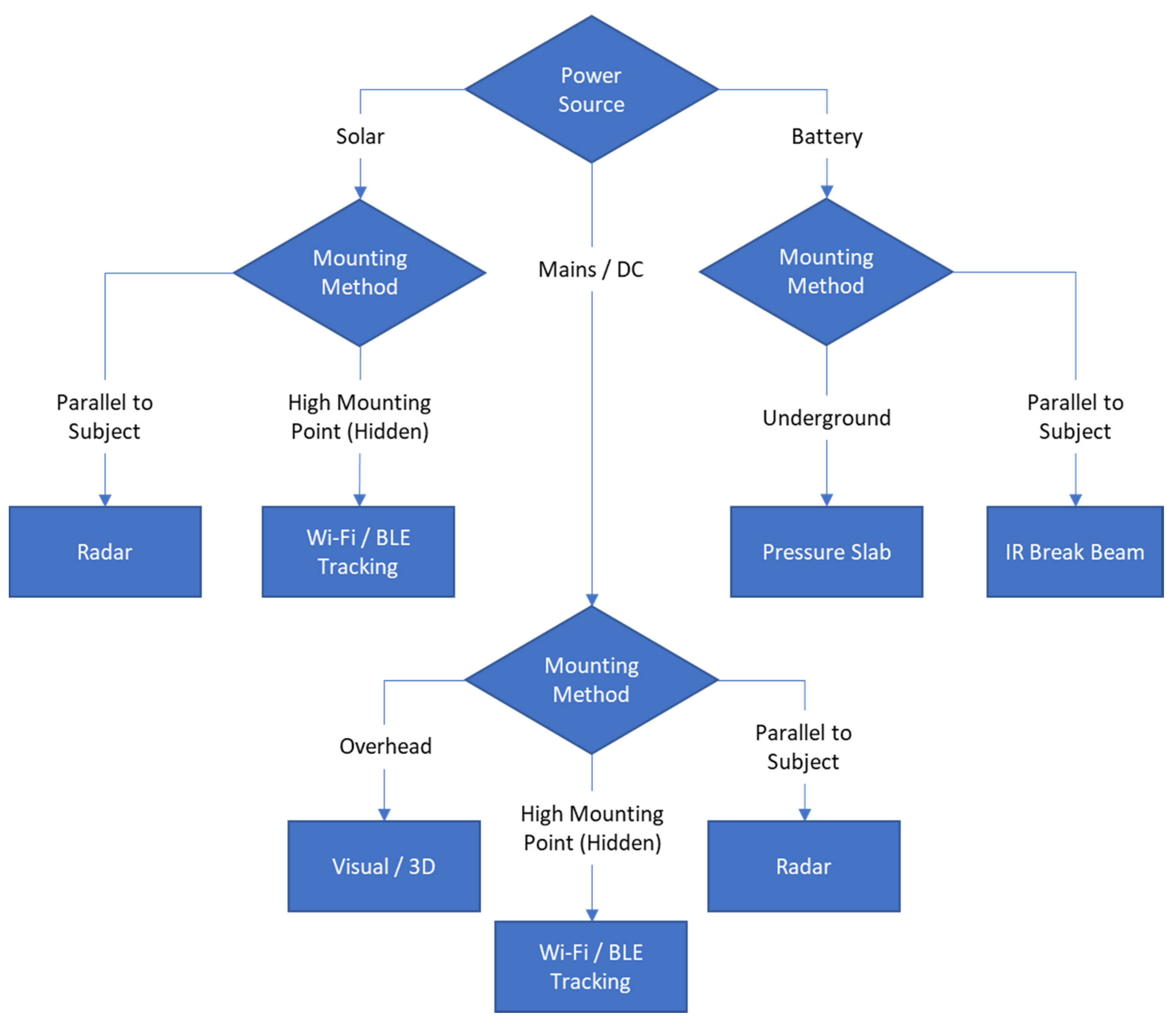
After an initial assessment of these technologies, we decided to focus on overhead mounted 3D visual sensors (with night vision) that can be AI-enabled to recognise other human presences (eg, on bikes) subject to bulk costs. Here we see a gap for counting populations entering areas via other vehicles, but this margin of error can be presented in the user-facing application. We may also implement these devices effectively underground.
Relevant human-computer interaction literature
The manipulation of smartphones during pedestrian navigation has been studied to pose risks to personal safety—
“...the pedestrian's line of sight switches between the screen and the environment which causes ‘inattentional blindness’ during emergencies...”
As such AR interventions may be more effective for efficient and safe navigation than conventional 2D maps, and the paper studies the foreground and background light and contrast challenges posed by such technologies during nighttime pedestrian navigation (Lee et al., 2023) which we may use to implement potential AR navigation solutions (for details see Appendix C)
However, with AR enabled in smartphones and 2D navigation smartphones in the context of street crime, pedestrians are more vulnerable to theft. (Kitamura et al., 2020) thinks that smart watches can avoid the problem of distraction while using smarphones to some extent. We may hence also explore wearable technology (smartwatch/eyeglasses) navigation as the primary potential solution while understanding that from a practical/commercial standpoint a mobile app would be most viable.
Another comparative study on the use of digital maps, paper maps, and voice-assisted digital maps suggests voice-assisted navigation improves users’ confidence in finding their way (Xu et al., 2022), along with other insights (for details see Appendix C).
An older study gives interesting insights on the use of haptics in pedestrian navigation. The study uses 4 haptic feedback mechanisms to guide users through a path without visual/landmark-based navigation. Users were able to successfully navigate to the destination and had better recall of the path when compared to using visual maps (Jacob et al., 2012) (for details see Appendix C).
We may hence explore the opportunity for attentive pedestrian navigation in dangerous situations through haptics and voice with little reliance on visuals. Here, wearable technology can be a powerful and safer means of navigation.
After concluding the ‘Discover’ phase, the need for a focused design solution that can address the user's journey in various perspectives was realised.
2.4 Define
Based on primary and secondary research conducted in the ‘Discover’ phase, a business model canvass, a mind-map, user personas and a user journey map were created to identify significant pain points in the process faced by key users.
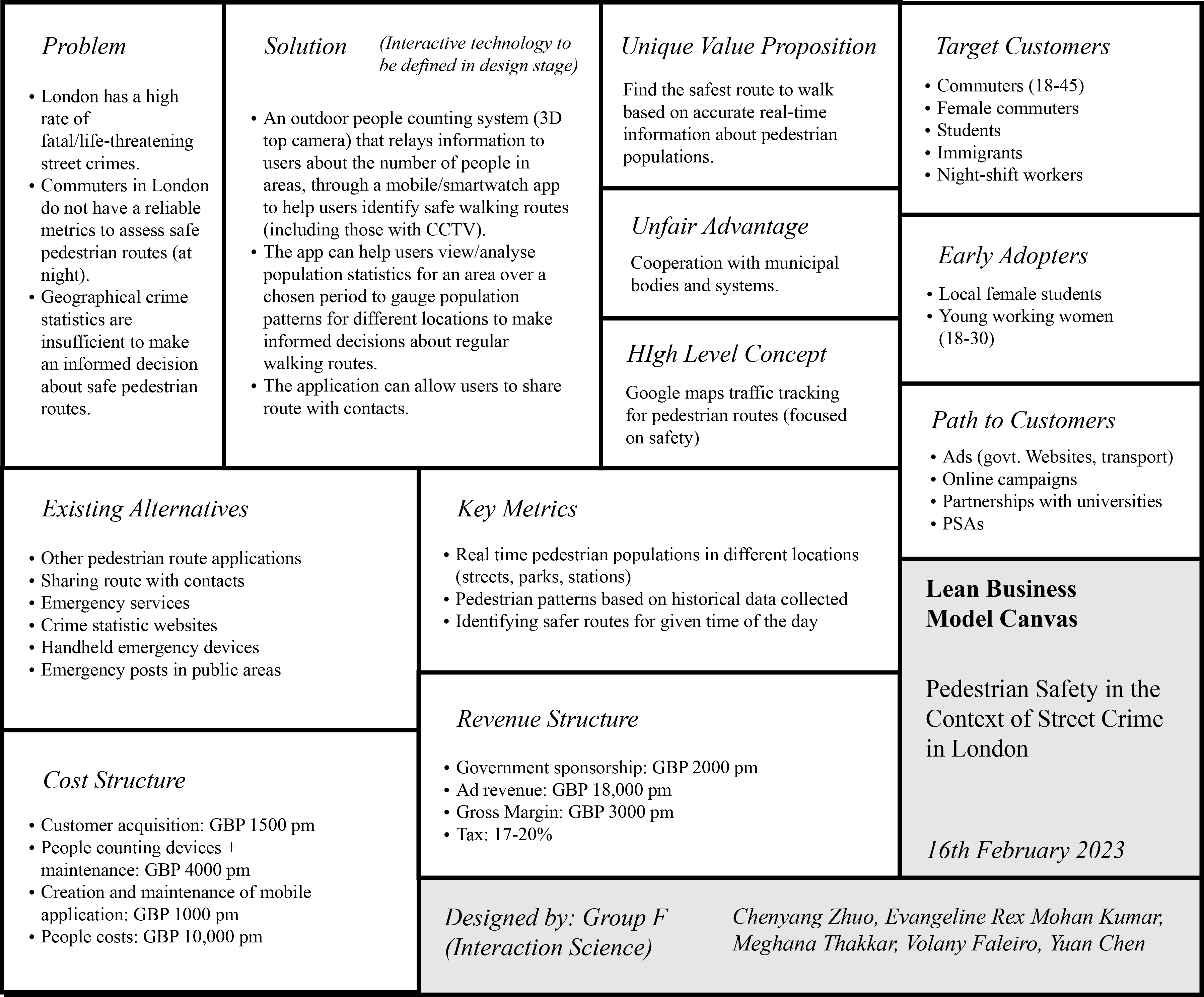
Business model canvas
The Business Model Canvas presents a solution to improve pedestrian safety in London, addressing the lack of reliable metrics for assessing safe walking routes. The solution uses AI-enabled outdoor people counting systems with 3D/visual sensor technology to provide real-time data on pedestrian populations, helping users identify safer routes and receive alerts about potential risks.
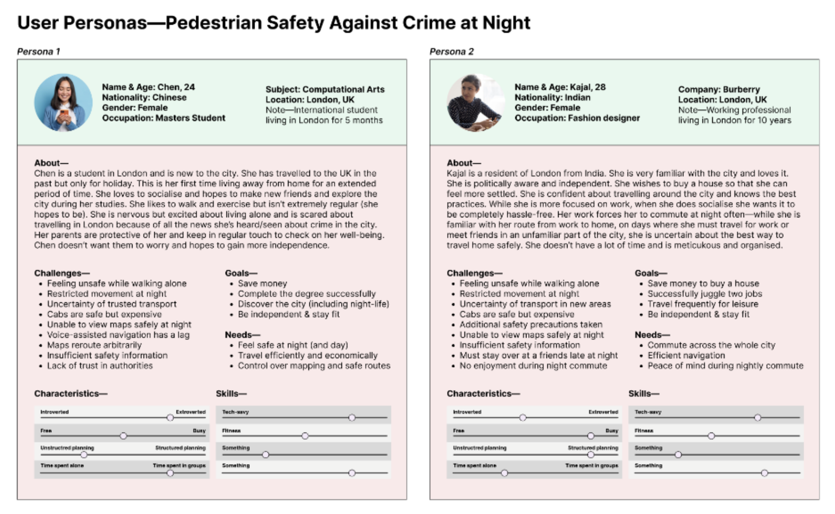
User Personas
Mind Map
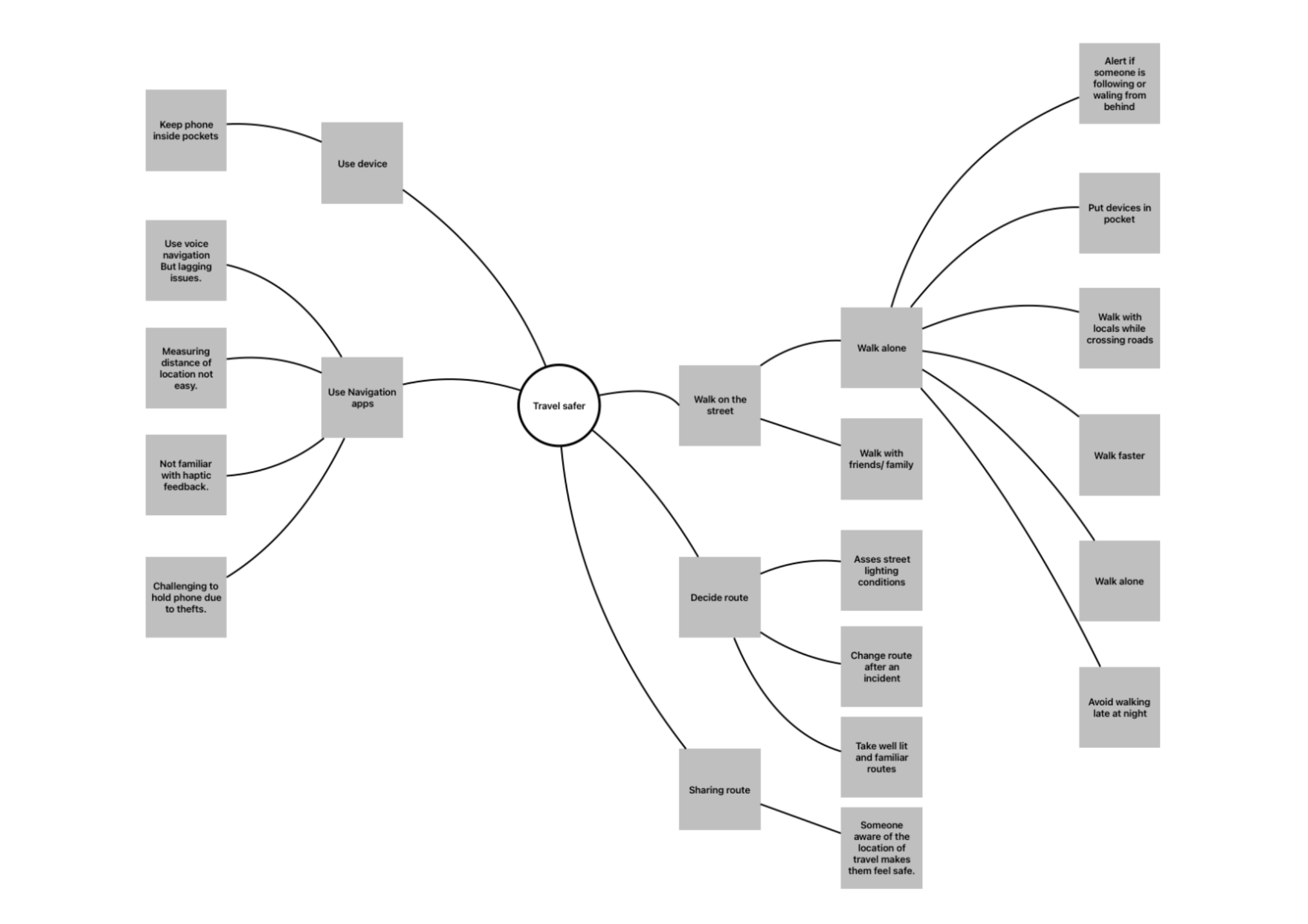
To put the collected data into perspective, a mind map was created to consolidate the entire user journey from deciding to navigating the streets in terms of safety perception. Key patterns emerged that show the key activities of users. The activities include (1). Deciding route, (2) Using phone/navigation apps, (3) walking on the street, (3) sharing route. This helped us form the primary categories of the user journey.
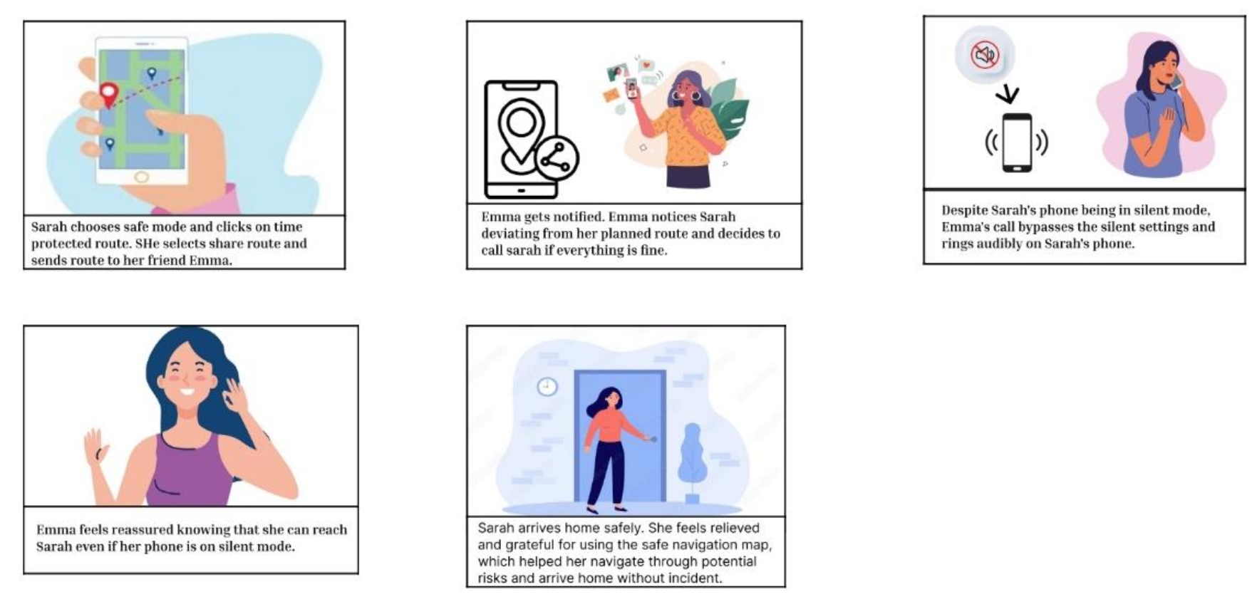
User Journey Map
Key Takeaways—
- Users want help in the event of an emergency while walking home alone at night.
- Users can share real-time location with their friends or family to ensure that they are followed.
- The software can update the street lighting and pedestrian flow information in real time.
- Users want to know the safety rating of different areas.
- Users have psychological burdens before the trip and hope to be relieved.
Problem Statement
“As a user I want to be able to travel home safer, but I cannot do so as the current technology doesn't keep me informed of the various safety concerns. I need an efficient way to travel home safer.”
2.5 Develop
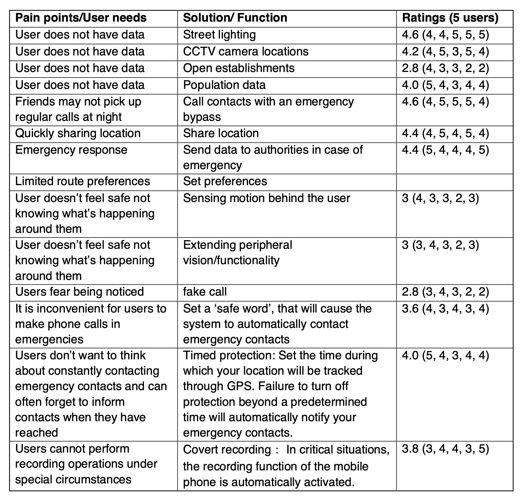
To develop a solution, first, the core functionality of the solution was considered. While users had a clear goal—reach home/to a location safely—the ways to tackle the task were many. After brainstorming a list of functions and how they might be executed, they were rated by users to understand what they consider important (see Appendix C for details). It was also important to consider the gap in the current market. Based on these findings an initial concept was developed.
Concept
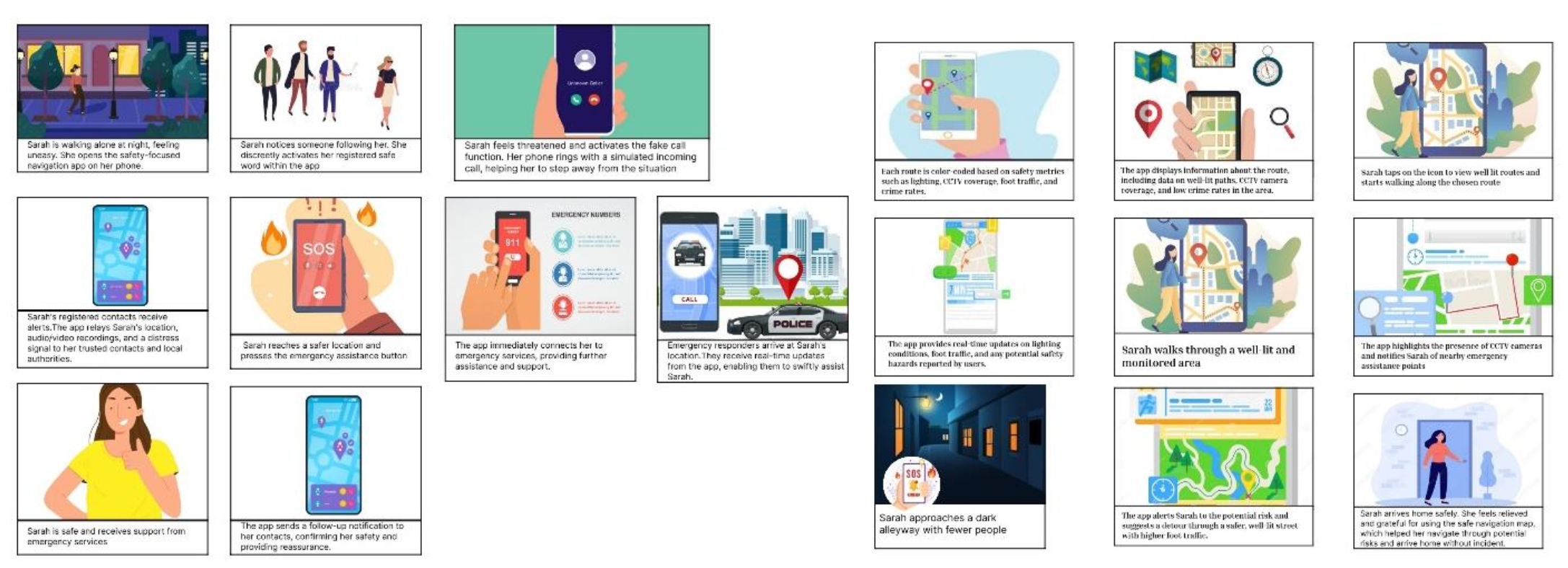
This concept uses data based on safety metrics to provide safer routes and provides some additional functions. The following is the final list of functions for the solution:-
- Providing/using infrastructural data to provide safe routes—CCTV camera, street lighting conditions, population data
- Providing user reports about the same data and other incidents
- Providing various routes based on safety metrics and logistics
- Sharing routes with contacts efficiently
- Efficient emergency button
User Story Mapping
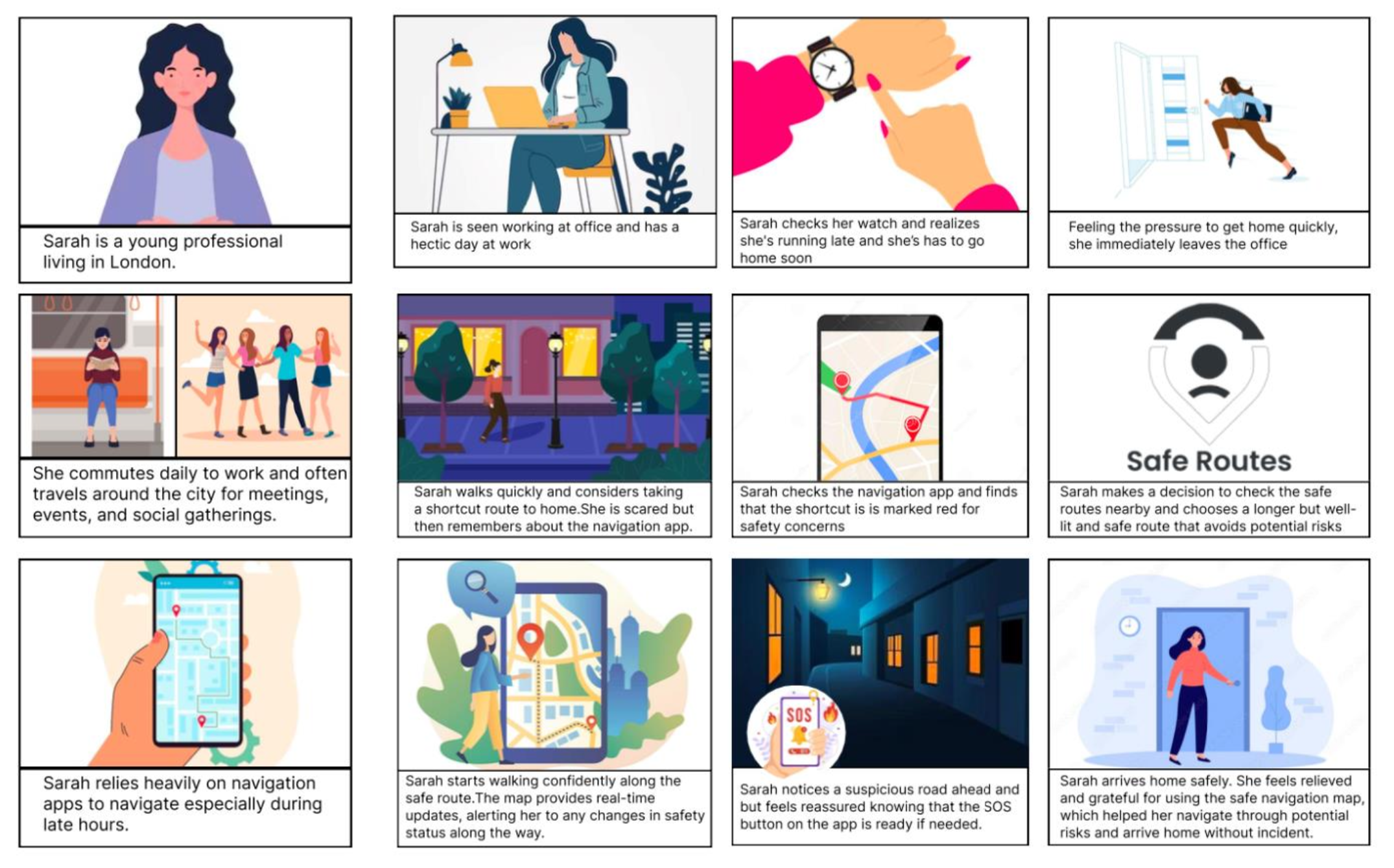
Based on the findings from the conceptual testing, user story mapping was undertaken to establish key user steps. Activities in each of the steps were brainstormed to create a draft visualisation of how the process might look.
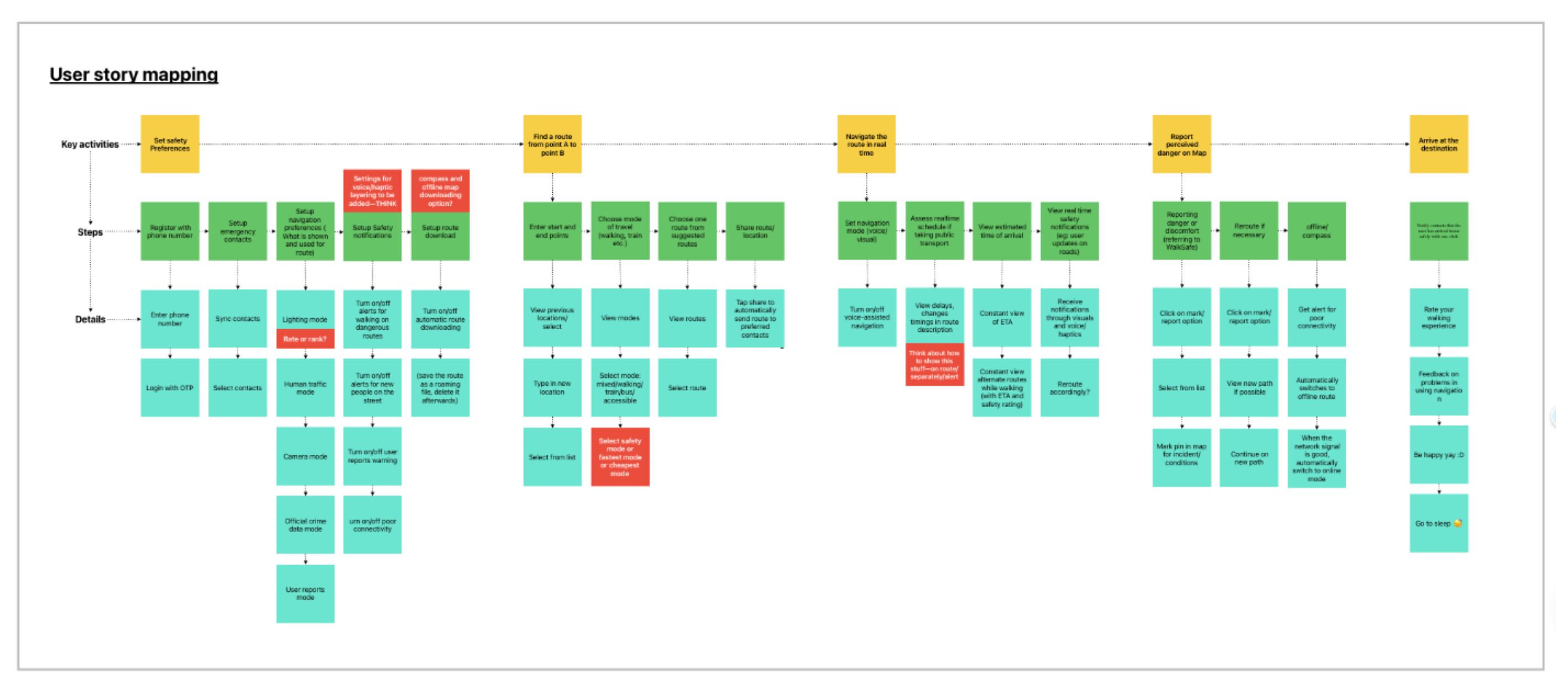
Following user story mapping, a more granular approach was taken prior to designing the actual wireframes by formulating user stories and user flows.
User stories
The task was to create a visual representation of how the users might navigate the app. User stories were created to identify the user and the state of their goal. Insights from the user story mapping assisted in formulating the information hierarchy.
As a user with a safety way-finding system—
- I want to be able to see the safety information quickly
- I want to be able to set and select my safety preferences
- I want to be alerted during the journey about any possible warning/danger.
User flows
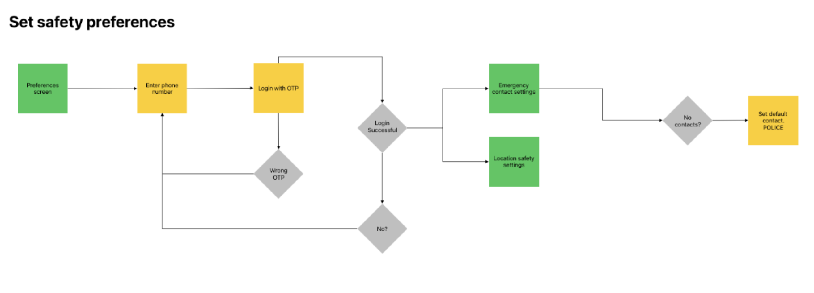
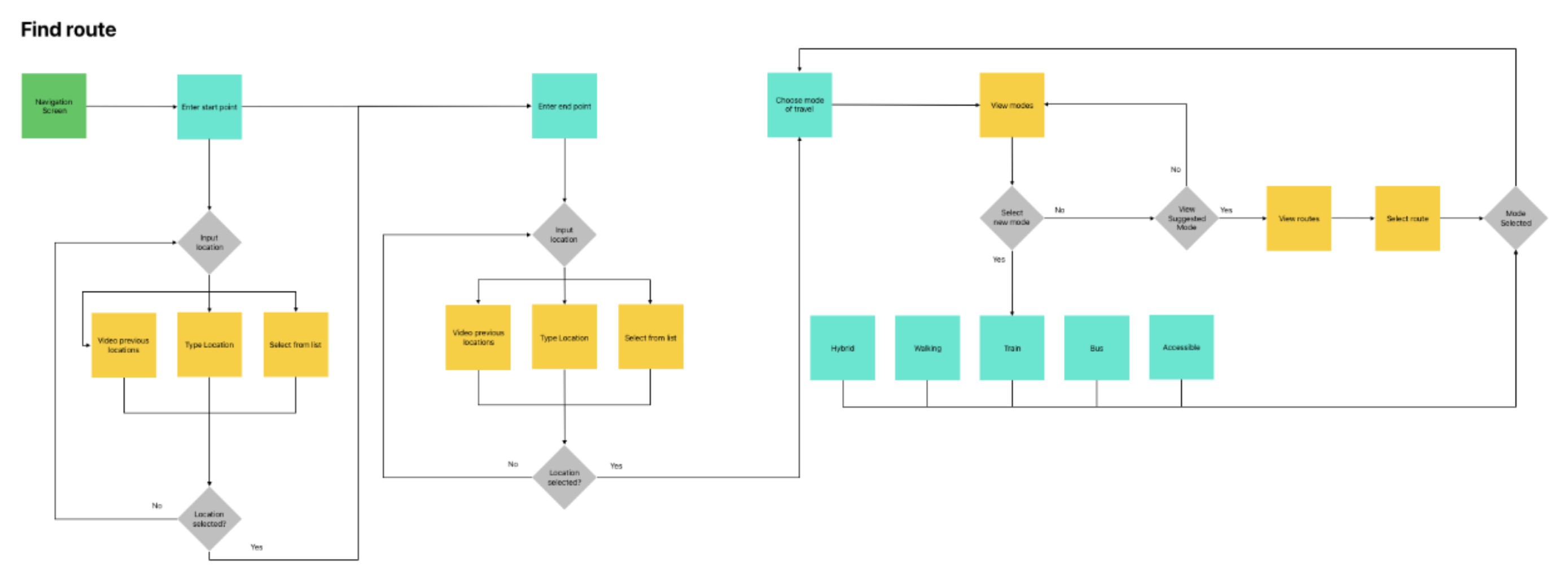
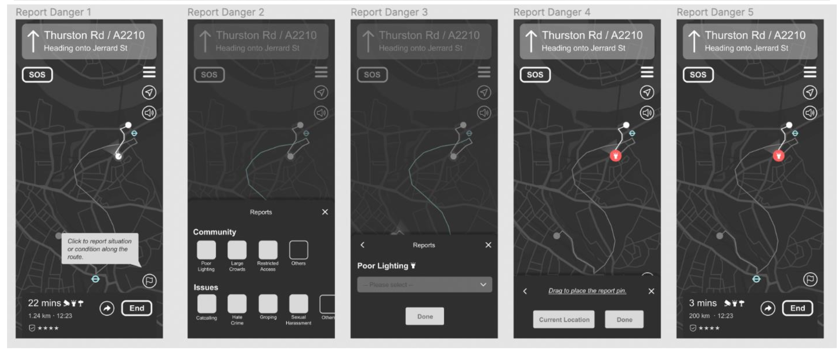
User flow diagrams were created to address the touchpoints, decisions and actions of the users when interacting with the application. The key flows are as follows: (1) Set safety preferences, (2) Finding route, (3) Navigating route, (4) Reporting perceived danger and (5) Finishing journey.
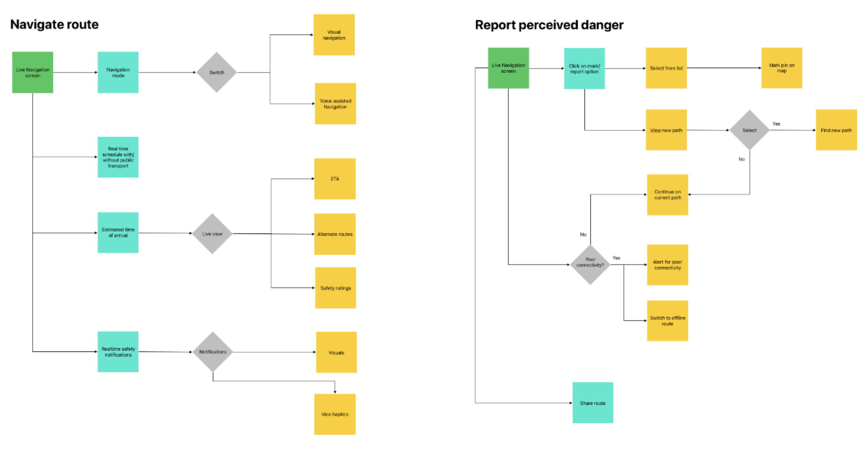
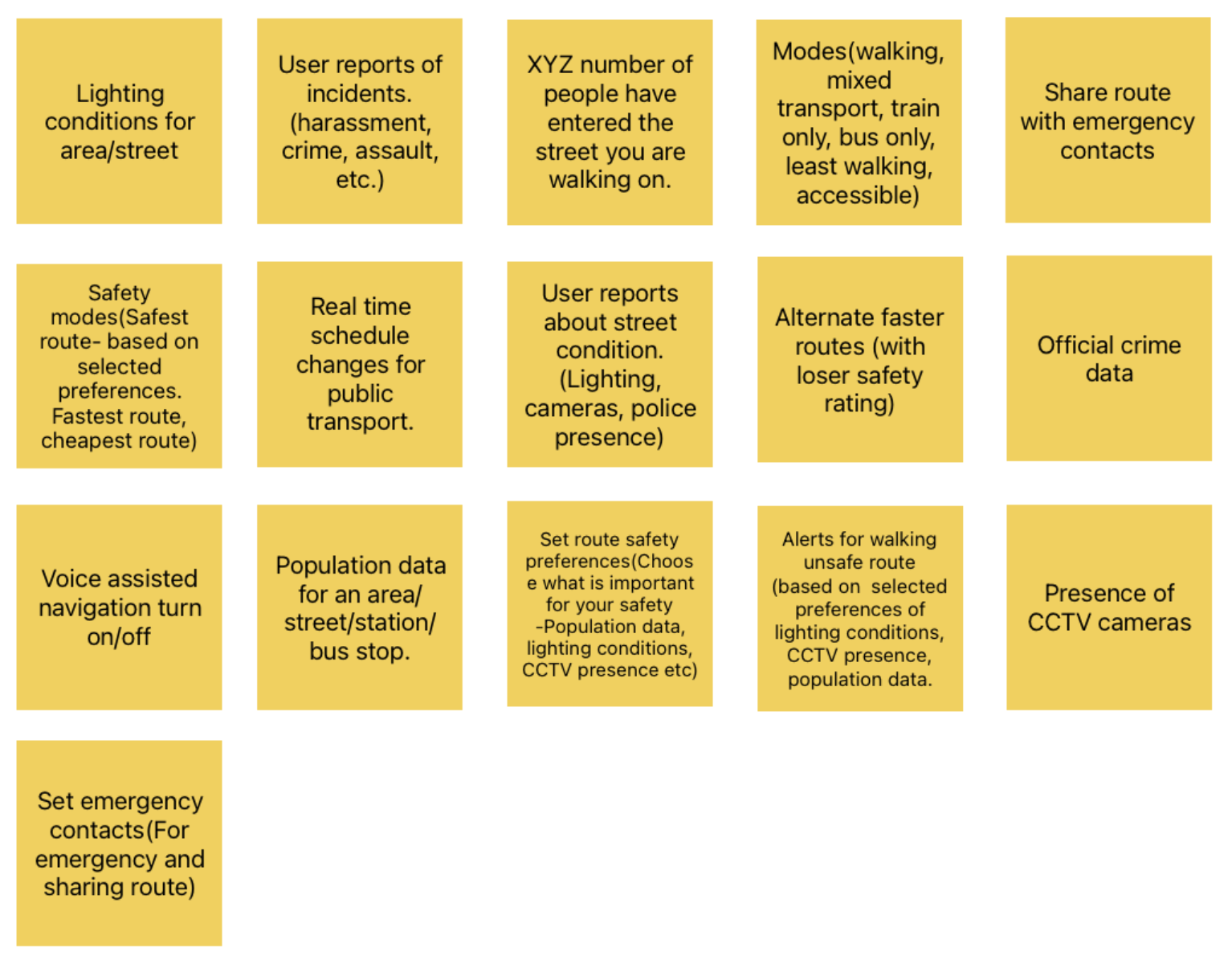
Card Sorting (see Appendix D for details)
The user flows were validated/changed using a card sort to assess the effectiveness of the proposed information architecture. The card sort had predefined categories to understand where users would need certain data/functionality.
The following was discovered from the card sort analysis
- Most users preferred setting up safety route preferences in settings
- Users did not want to be overwhelmed by data during the navigation
- The emergency response button should exist primarily during navigation
- Users did not prefer getting too many alerts during navigation
Treejack Testing (see Appendix E for details)
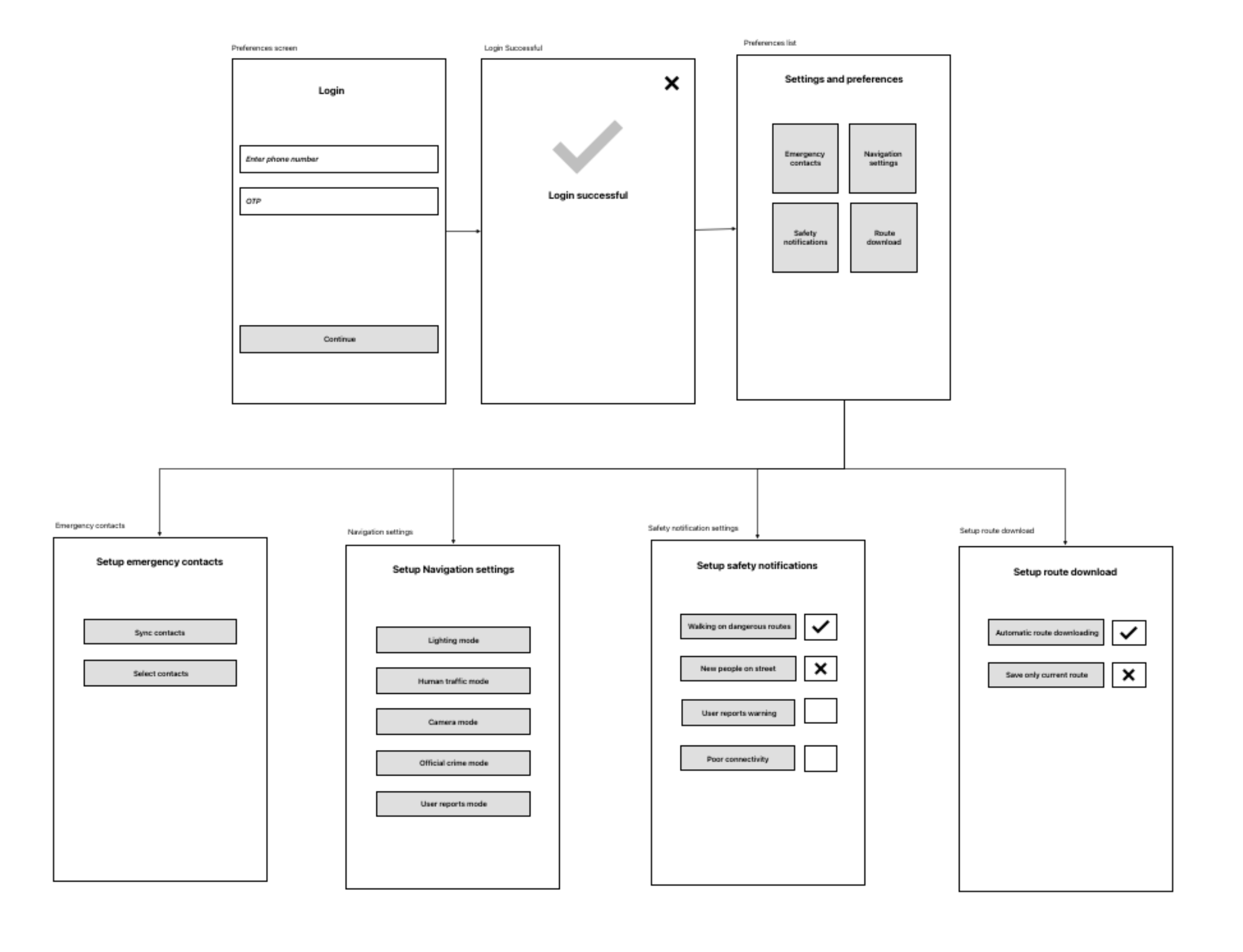
The information architecture for the ‘Settings’ was tested through a tree-jack revealing the following insights:
- Users took time to understand/recognise the safety functions
- Users may need to be educated about the application functions
- It would be best to set default preferences that the users can edit later
- Users would require visual cues to navigate through settings
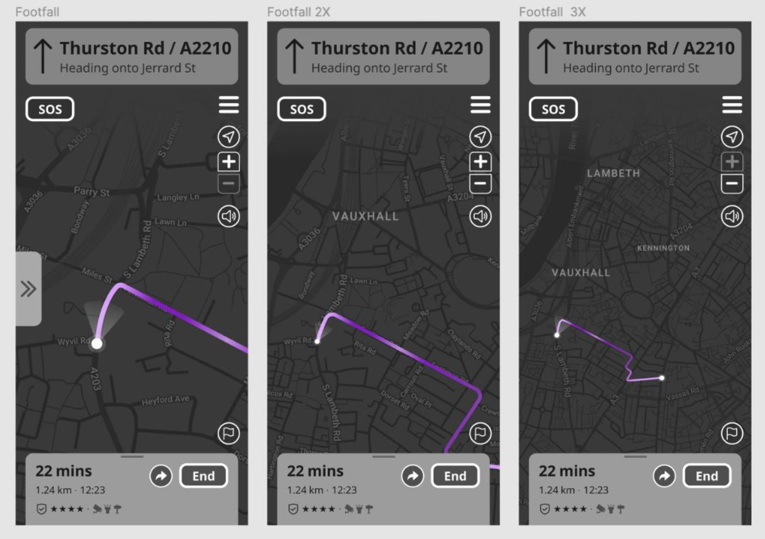
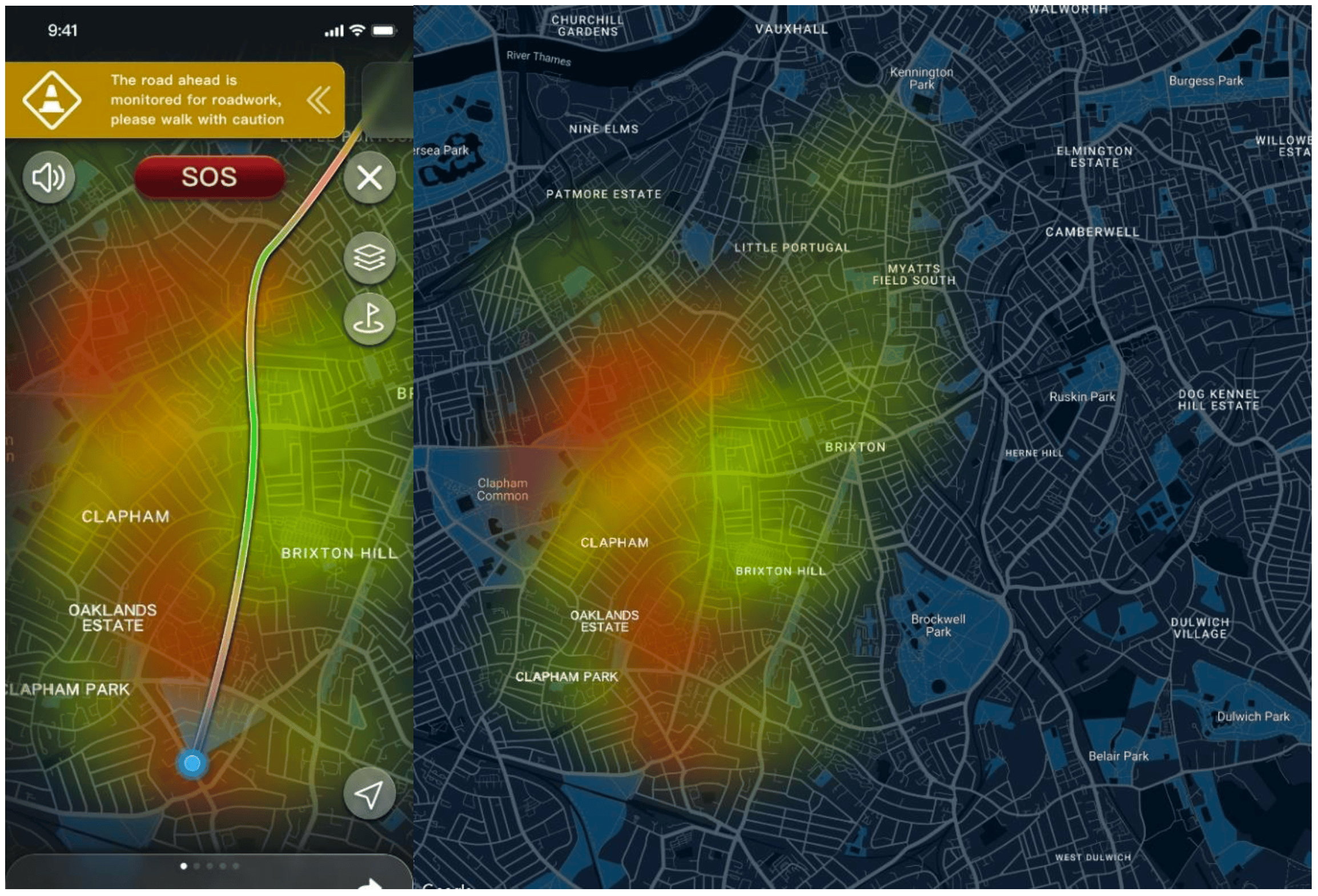
It was concluded that the application would have default safety preferences (to be edited by the user) that would inform the route and have optional layers of data for the user to view during navigation. The various route descriptions would also show what safety metrics were included to inform the route.
Ideation
One of the chief considerations for this solution was to explore the visual representation of this complex data in the context of navigation. While mental models existed for layering information on applications such as Google Maps, the nature of the data to represent within this solution was different and more vital to the core functionality of the application.
Another important consideration was the method of navigation. The research showed, unequivocally, that users did not prefer to navigate visually on their smartphones for fear of theft. Voice-assisted navigation was already the preferred method but had its problems in existing solutions, such as lag and the inability of users to estimate distances. To address these concerns, initial sketches and wireframes were followed by evaluating the solutions with the potential users.
Sketches—
Initial sketches the focus was to map the user flows and journeys, the visual context of the navigation, page structures and layouts along with the content information and hierarchy.
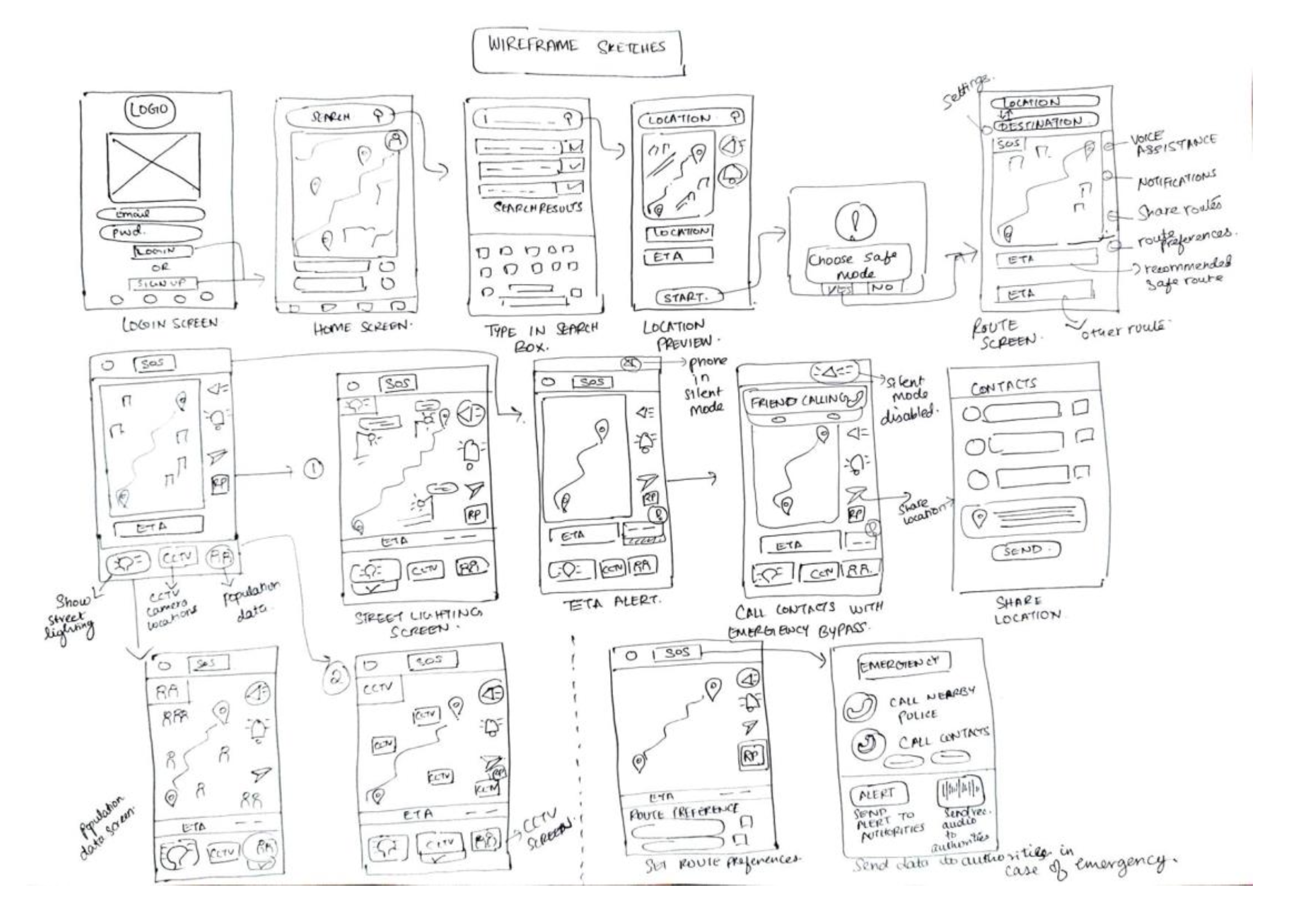
The sketches were assessed within the team and by feedback from students at Goldsmiths University for quick validation. More time was spent in creating visual wireframes (prototype1) that was used to measure actual feedback from the potential users after realising the solution would heavily rely on visual cues to educate users.
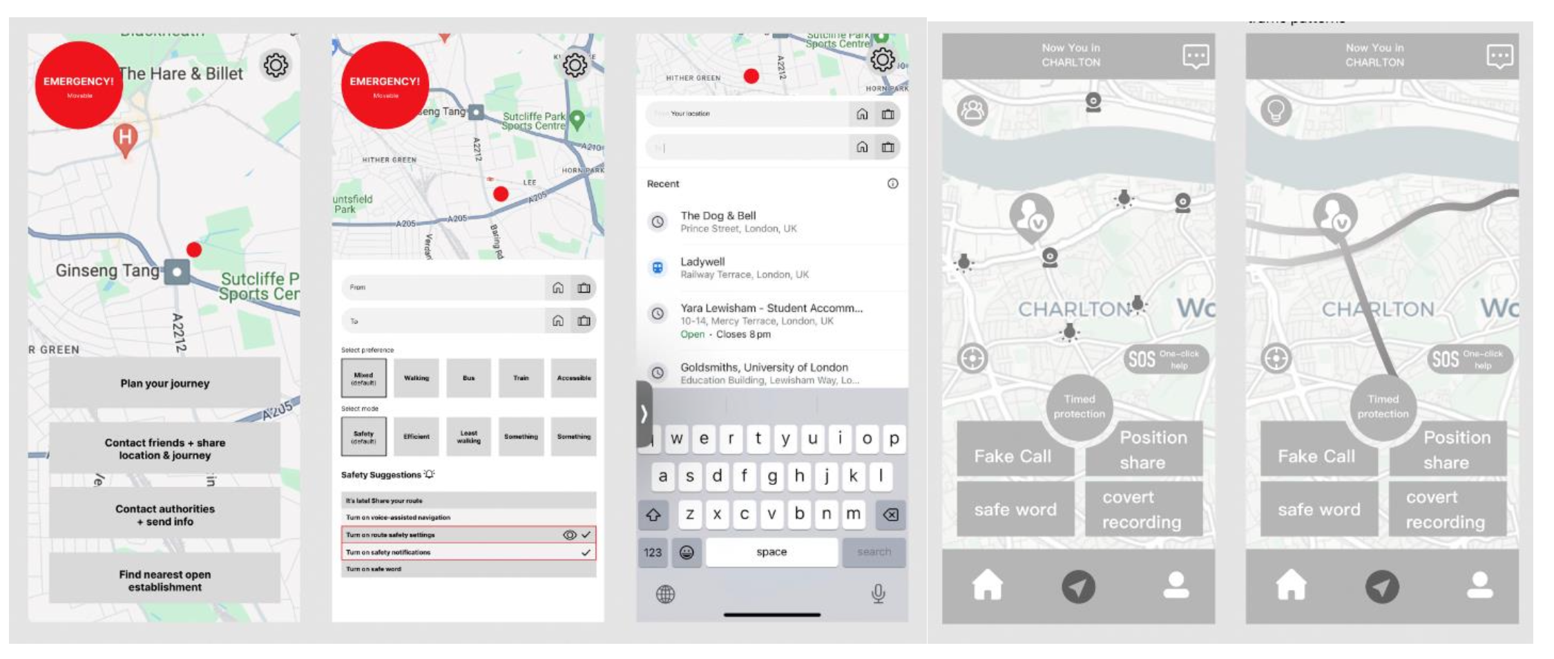
Prototype 1
The principles of UX design from (Saucken, Constantin 2013). formed the basis of our design decisions for the first prototype and the entire evolution of the design solution. The principles applied to this prototype were:
Trigger perception via several senses—
Providing constant visual and acoustic feedback to the users during the navigation activity via feedback through alerts & voice assistant.
Create pleasant anticipation—
Creating an appealing and aesthetic user interface to create a positive anticipation for the users. A minimalistic and dark mode interface for night navigation would reduce the cognitive load on the users thereby creating a pleasant experience.
Meet psychological needs—
The fulfilment of the psychological needs of the users, i.e. reaching home safely will create a positive UX.
Allow learning process—
Users already have knowledge by using other similar products like navigation apps. A consistent interface throughout and recognition rather than recall would create a positive learning and interaction experience for the users.
Ensure Usability—
Ensuring that the flows work as proposed in helping users attain their goals can help use retainment and create a sense of trust and high influence towards the overall judgement of the product.
Testing Prototype 1 (see details in Appendix F & G)—
This wireframe was tested through ‘first-click testing’ and ‘exploratory testing’ with users and revealed the need for the following improvements:
- Icons must be made more recognisable
- The ‘report incident’ must be rephrased to avoid confusion with the ‘SOS function’
- The destination icon must follow existing mental models
- Alerts must be more prominent
- Use more colour to highlight important features
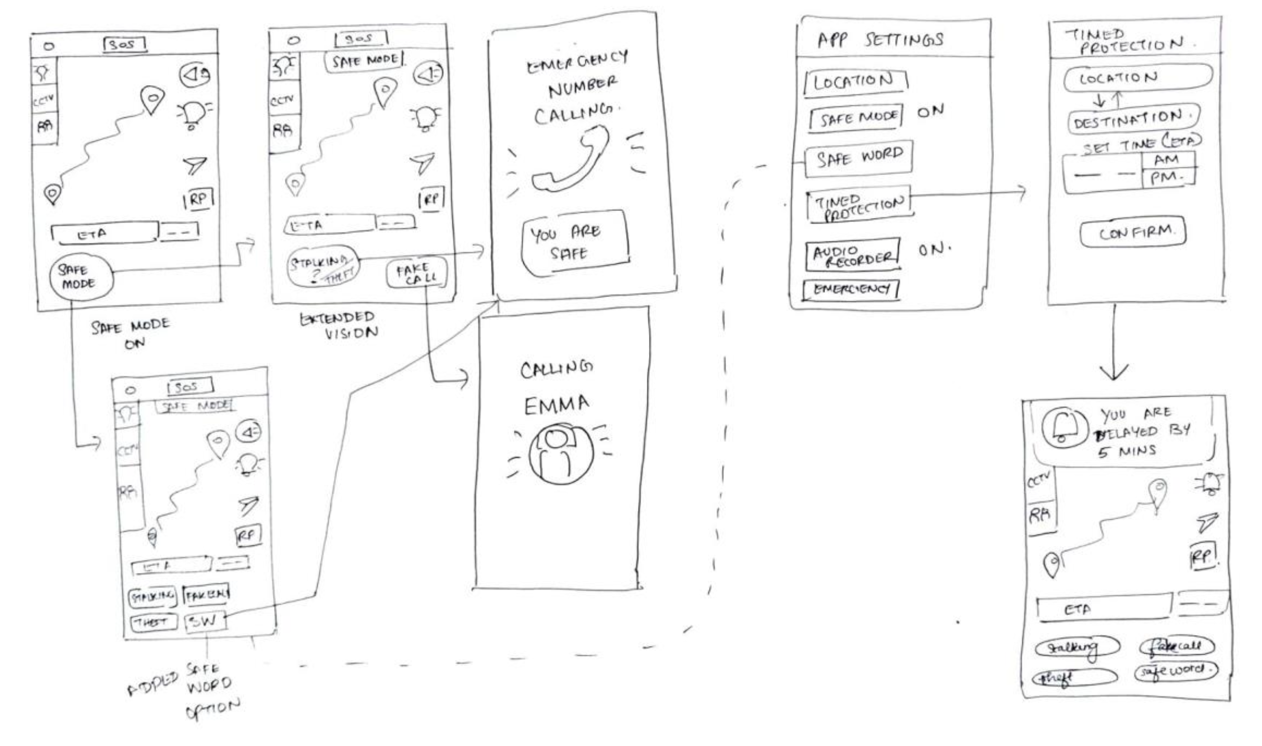
Prototype 2
After the creation and testing of ‘Prototype 1’, a second medium-fidelity prototype was created focused on greater interaction detail related to data layering on the map. This prototype consisted of additional layers to show data about safety metrics and how they would function at different zoom levels.
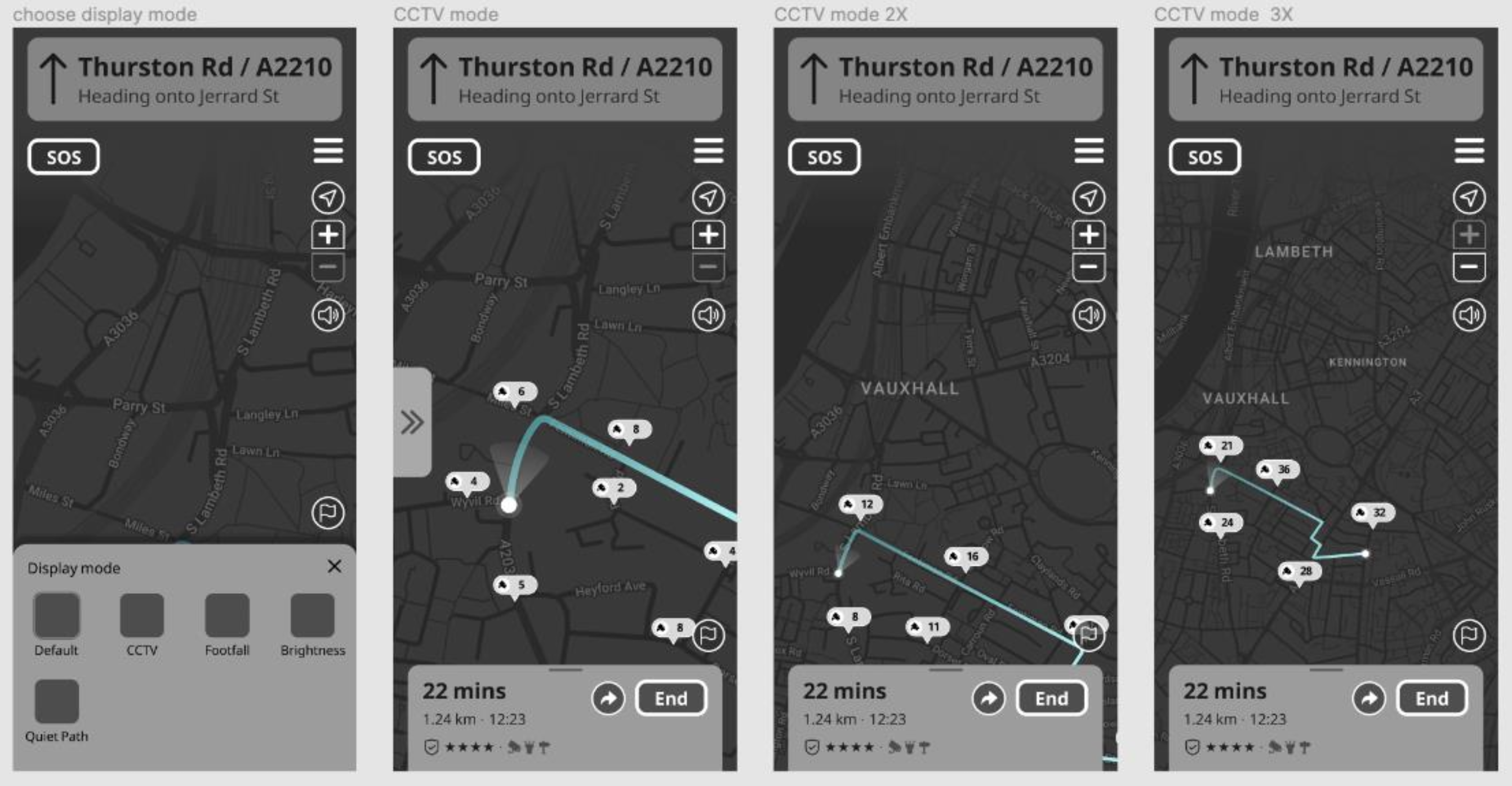
Testing Prototype 2 (see Appendix H)—
This prototype was tested internally using eight of the heuristic principles to make further improvements as listed below:-
- Visibility of System Status
Status indicators, real time updates and alerts along with the current status of the journey must work as intended. - Match Between the System and the Real World
Some icons needed to be altered to comply with existing mental models - User Control and Freedom: Increase options to switch and exit functions
- Consistency and Standards: The application was consistent and new changes must be applied across the application
- Error Prevention: Various exit points for functions such as navigation, route selection, and map modes must be added
- Recognition Rather than Recall: Navigation directions must be made more detailed as per the route information
- Flexibility and Efficiency of Use: Exit points and switching between functions must be made efficient with fewer steps
- Aesthetic and Minimalist Design: The dark mode UI is appropriate for nighttime navigation, but colours must be added for better visibility, minor alterations in the background and foreground colours and representations must be made to follow ideal accessible benchmarks for nighttime navigation (Material Design)
Prototype 3
Using the collected feedback from ‘Prototype 1’ and heuristic evaluation of ‘Prototype 2’, ‘Prototype 3’ was created. Additionally, a small prototyping exercise was conducting to assess the voice-assisted navigation possibilities for the solution.
Digital Visual Prototype—
Based on feedback collected from the wireframe tests, a medium-fidelity prototype was created for evaluation. It is focused on a particular user flow essential to the application:-
Route input > route selection > preview > navigation > share route > view safety data on map layers/modes > receive and close an alert > end navigation > provide feedback
3. Evaluation Plan (Deliver)
Recruiting participants: Four participants falling within the user group were recruited through email/messages to students at Goldsmiths University of London, peer groups outside the university, and previous interviewees who were interested in participating in further research for this project.
Obtaining Consent: A Consent & Privacy Statement were read to the users in order to obtain verbal consent for both studies (see ‘Consent & Privacy Statements’ in Appendix I)
Pilot studies: Pilot studies were conducted by the facilitators for both the studies with another group member
3.1 Digital visual prototype
In-person Moderated Usability Tests
Users—
- Student/working females aged 19-30
- Residing in London
- Often walk alone at night
- Experienced with using mobile apps and digital maps (Google maps)
Location—
Yara Student Accommodation (outdoors)
Date & time—
16th April 2022, 20:00-21:00 (during the dark)
Roles—
- Facilitator (moderator): Meghana Thakkar
- Note-taker: Volany Faleiro
Goals—
- To test the user flow of route input > route selection > preview > navigation > share route > view safety data on map layers/modes > receive and close an alert > complete navigation > provide feedback
- To identify any usability issues within this user flow
- To test the ease of navigation within this user flow
- To assess the comprehension of the route safety information provided during route selection
- To assess the ease of viewing layered information on the map without cognitive overload (population data and placement of CCTV cameras)
- To gain qualitative feedback on the dark mode user interface design
Tasks—
1. Task 1: Input route and select the preferred option based on safety metrics shown for each route
Instruction: Imagine you are walking back home after a late day at work/college and want to find a quick but well-lit route home?
- Is the information provided with the route options clear and sufficient to help you choose the best route to go home?
- Did you understand the logistical information provided about the different routes including estimated time, transport methods? Did you find it helpful and sufficient?
- Did you understand the safety metrics provided for each of the route options and the reason for the recommended route?
- Did you face any challenges during the route input & selection process? If yes, what were they?
2. Task 2: Share the selected route with an emergency contact after clicking the ‘start button’.
- Was the ‘share route’ feature efficient and easy to use?
- Was it intuitive to find and access?
3. Task 3: Explore and view the different map layers/modes
Instruction: Try to understand the population data and presence of CCTV cameras in the selected map area using the zoom in and out ability on the map
- Was it easy to find and navigate the application of layers on the map?
- Was it easy to understand the data shown on the different layers of the map (CCTV cameras and population data)?
- Did you face any challenges while viewing or understanding the data shown on the layered maps? If yes, then what were they?
4. Task 4: Explore the navigation function
Instruction: Imagine you’re walking on a street at night trying to get home and you receive an alert at some point during your journey. Start navigation, view and close the alert, end navigation, and provide feedback.
- Did you find the alert function to be distracting?
- Did you find the alert to be insufficient?
- Did you face any challenges while reacting to the alert on the screen? If yes, what were they?
- Any additional comments?
Post-test questions—
- Did you find the application easy to navigate? If no, then why?
- Did you find the UI to be pleasant or harsh on the eye at night?
- Did you like the UI? If no, then why? Please mention any thoughts about the UI
- Do you have any additional comments or suggestions?
3.2 Voice-assistance Prototype
Experimental Design—Within group testing
Users—
- Student/working females aged 19-30
- Residing in London
- Often walk alone at night
- Experienced with using mobile apps and digital maps (Google maps)
Location—
Yara Student Accommodation (outdoors)
Date & time—
20th April 2022, 15:00-17:00
Roles—
- Wizards (moderators): Meghana Thakkar & Chenyang Zhuo
- Timers: Volany Falerio & Yuan Chen
Hypothesis—
Using only voice-based navigation, a user will be better able to understand directions with colloquial instructions in addition to distance-based instruction, than directions based only on distance.
Independent variables—
- Only distance-based voice instructions (example take a right in 200 metres on to Jerrad Street)
- Colloquial voice instructions in addition to distance-based instruction (example: take the third right in 200 metres on to Jerrad Street)
Dependent variables—
- Efficiency in navigation
- Comprehension of instruction
Metrics—
- Time taken to complete navigation
- User satisfaction (feedback on ease of comprehension)
Bias: Control—
- The task sequence will be randomised to avoid anchoring bias
- The selected routes will be of similar complexity and distance
- Directions will be given at the same intervals as Google Maps during both tasks
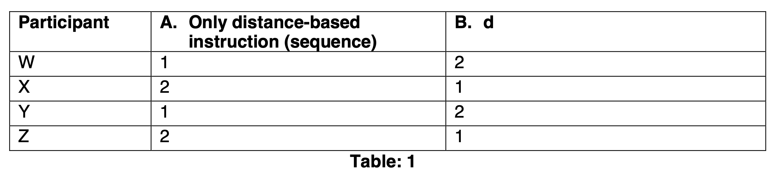
Participant
1. Only distance-based instruction (sequence)
2. Distance + colloquial instructions (sequence)
Possible random errors—
street conditions, weather conditions, traffic, incidents
Potential systematic errors—
limited sample size, age factor, familiarity/unfamiliarity with traffic conditions
Tasks—
1. Only distance-based instruction
Task: Use Google Maps to find a route from ‘Your Location’ (Yara Lewisham), to ‘Enish’ (Lewisham High Street). Turn on voice assisted navigation using earphones/headphones and keep the phone in your pocket/bag. Follow voice instructions to navigate (walk) to the destination
Note: Meghana and Steve will follow from behind. Steve will time the journey.
2. Colloquial + distance-based instruction
Task: Use Google Maps to find a route from ‘Enish’ (Lewisham High Street) to to ‘31-51 Marischal Road’. Pick up the call from the Wizard and use earphones/headphones to hear instructions and keep away the phone in your pocket/bag. Follow the modified voice instructions to navigate (walk) to the destination
Note: Meghana (The Wizard) and Steve will follow from behind. Meghana will give directions over call while looking at the route on Google Maps and will have already familiarised herself with the route. Steve will time the journey.
Note: The sequence of routes will remain the same (i.e. Yara to Enish to Marischal Rd). The task sequence will be switched between A and B (Table 1)
Post-experiment Interview Questions—
- In which of the two tasks were the voice directions easier to follow? Or did not make a difference?
- In which of the two tasks did you feel more confident in the directions you had to take?
- Did either of the task directions make you feel overwhelmed?
- Do you have any other comments?
4. Experimental Results
4.1 Digital Visual Prototype (see details in Appendix J)
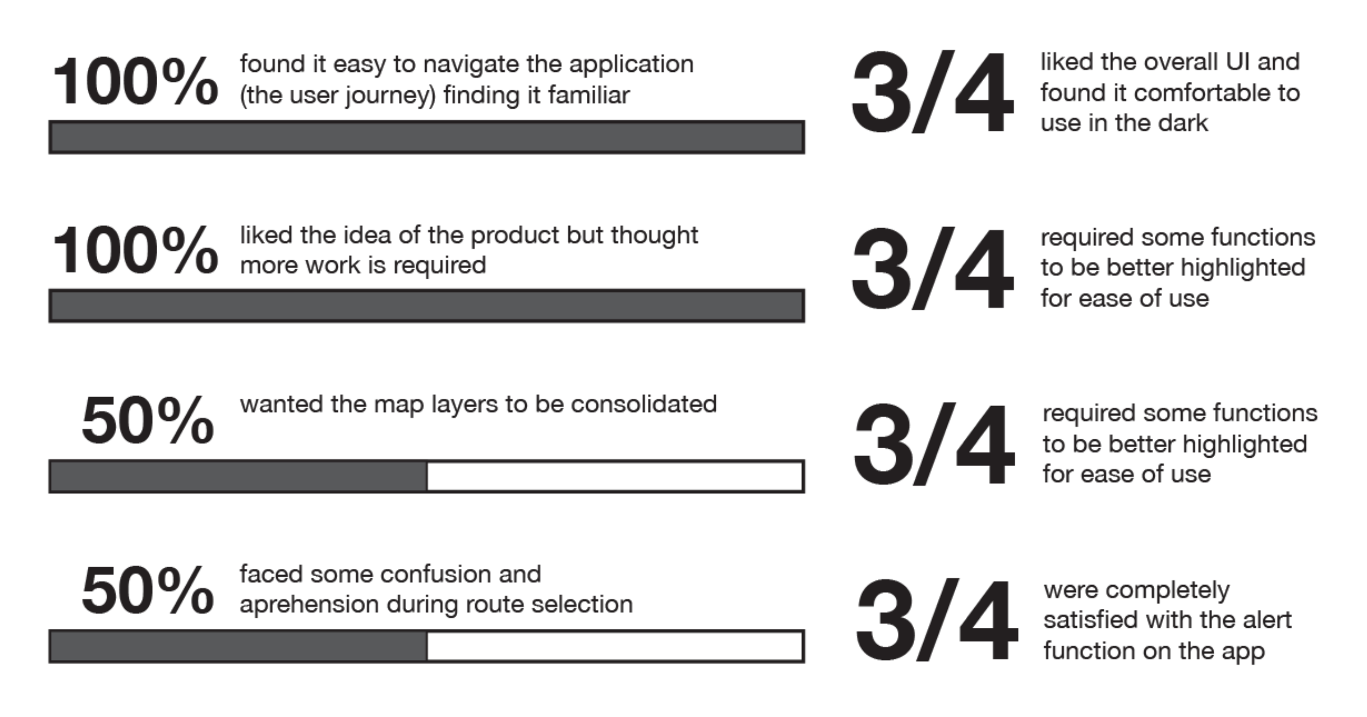
Positive Feedback Highlights
- Good dark mode UI
- Intuitive navigation throughout the application
- Non-distracting alerts
- 4 of 4 participants enjoyed the ‘share route’ function
- Mental models for viewing layered maps followed
“It's easy to understand the data for the map layers” - Clear logistical details for route selection
Critical Feedback and Future Implications
- Safety metric icons require some learning and prominence
- End navigation button to be reassessed
- More options to view various data and functionality before the navigation stage
- Colours need to be made more differentiated and solid in map layers
- Make data available for entire map area, further explore how to visualise this best
3 of 4 participants wanted the map layer icon to be more prominent - Need to come up with strategies to inculcate trust
Future Scope
- To add different viewing modes (light and dark)
- To explore strategies to inculcate trust in the safety data
- To explore other functions in depth
- To explore the communication strategies between different users reporting conditions on the map
- Explore technologies and solutions for offline maps
4.2 Voice-assistance Prototype (see details in Appendix J)
Summary
- 3 of 4 users liked the idea of having added colloquial directions to distance-based ones
- 1 of 4 users said they would require only colloquial directions
- 1 of 4 users was skeptical about the idea and didn’t see the need for it
- 2 of 4 users completed Task B in a shorter time frame by 10 and 50 seconds
Future Scope
- To expand study by sample size and duration
- To conduct study at various times of the day
- To introduce haptic feedback for alerts to understand the relationships between voice-assisted and haptic-based navigation
In addition to the prototype, some high-fidelity screens were designed to explore the visual styles for safety data map layers. These were designed in more detail as it is unique to this application and visualising these layers would be essential to the successful usage of this application.
5. Conclusion
While a lot of maps, safety-driven or otherwise, exist, we believe it is important to include infrastructural data to help users find safer routes. It was particularly challenging to arrive at common safety metrics and these may still need to be explored further through primary research about perceptions of safety.
6. Bibliography
Clune, S.J. and Lockrey, S. (2014) ‘Developing environmental sustainability strategies, theDouble Diamond method of LCA and design thinking: a case study from aged care’, Journal ofCleaner Production, 85, pp. 67–82. Available at: https://doi.org/10.1016/j.jclepro.2014.02.003.
Ma, S. et al. (2023) ‘A First Look at Dark Mode in Real-world Android Apps’, ACM Transactionson Software Engineering and Methodology, 33(1), p. 3:1-3:26. Available at:https://doi.org/10.1145/3604607.
Material Design (no date) Material Design. Available at: https://m2.material.io/design/color/dark-theme.html#usage (Accessed: 22 April 2024).
Personal security (no date) London TravelWatch. Available at:https://www.londontravelwatch.org.uk/campaigns/personal-security/ (Accessed: 15 February2024).
Saucken, Constantin & Reinhardt, Jakob & Michailidou, Ioanna & Lindemann, Udo. (2013).Principles for User Experience Design: Adapting the TIPS Approach for the Synthesis ofExperienceshttps://www.researchgate.net/publication/284723680_Principles_for_User_Experience_Design_Adapting_the_TIPS_Approach_for_the_Synthesis_of_Experiences
Tkiouat, Z., Léger, P.-M. and Titah, R. (2021) ‘Mobile Multitasking in Urban Contexts:Habituation and Countermeasures’, in M. Kurosu (ed.) Human-Computer Interaction. Theory,Methods and Tools. Cham: Springer International Publishing (Lecture Notes in ComputerScience), pp. 622–632. Available at: https://doi.org/10.1007/978-3-030-78462-1_48.
WebAIM: Contrast Checker (no date). Available at:https://webaim.org/resources/contrastchecker/ (Accessed: 25 April 2024).
Krause, R. (2018). Storyboards Help Visualize UX Ideas. [online] Nielsen Norman
Group. Available at: https://www.nngroup.com/articles/storyboards-visualize-ideas/.
7. Appendices
Appendix A—Discover—Primary Research: Field study and Contextual Inquiry
Field Study—Structure and Plan
Privacy & Consent Disclaimer
“Hello! Terribly sorry to interrupt, we’re UX researchers conducting research about pedestrian safety at night and would love it if you could spare a few minutes to answer some questions, we can walk and talk if you like.”
If they say yes:
“We must inform you that all information collected by us will only be used to gather insights for aproposed design solution and will remain entirely anonymous and confidential. You may refuse to answer questions and conclude the inquiry at any point for any reason and do not need to provide an explanation. Shall we proceed?”
If they say yes:
“Is it okay if we record your responses?”
Try to approach young women (18-37) but observe other users as well
Two states
- Day-time
- Night-time
Things to Observe
- How people navigate while walking: using their phones
- How people navigate while walking: using infrastructure (signs, traffic lights, streetlights etc.)
- How people walk in groups vs how they walk alone
- What other technology is used during navigation
- Any other noticable behaviours
Contextual Inquiry Questions
- How safe do you feel walking at night?
- What device are you most comfortable navigating with while walking at night?
- Do you face any significant challenges with these devices?
- Do you keep your device inside (pocket/purse) or hold it in your hand?
- Do you take any specific measures to be alert while walking at night? (like turning off your music, being vigilant etc.)
- Do you take any specific safety measures while walking alone at night? (like walking on certain streets, making sure the street is lit, calling a friend/relative etc.)
Field Study Observations (Lewisham):
- People generally walk fast when they are alone. While walking in groups, they walk at normal speed.
- People often wear earphones/headsets while walking
- People obey traffic rules but when the road is free, or if there’s a traffic jam and the signal is still in red, people still cross the roads
- New city-dwellers follow the locals while crossing the road
- People drive their vehicles fast
- In Lewisham, many ambulances have been passing by and police patrolling has increased
- People are more wary of other pedestrians at night
- People are negligent of other pedestrians in the daytime
- People walk in the designated pedestrian zones
- Pedestrians are vigilant of traffic conditions and signals
- People are often carrying many bags or items while walking
- Most people have their phones kept away
- Pedestrians prefer walking in well-lit areas at night
- Pedestrians walk faster at night
Find the transcripts for the ‘Contextual Inquiry’ here:
IS_Contextual Inquiry Transcripts_1-5
Appendix B—Discover—Primary Research: Semi-structured Interviews
Privacy & Consent Disclaimer
Hello! We are conducting this interview to help us design safe night-time navigation and to better understand user needs and experiences. All the data collected from this interview will be used for the sole purpose of research to design such a device and will not be shared with any other parties. As a participant you will also remain completely anonymous. Please feel free to ask any questions you may have about your data privacy for this interview. You are also free to leave the interview at any point you feel like and do not need to provide a reason. I would like to record the interview with your permission. However, if you are uncomfortable, I can take notes of your responses. Do you consent to this recording? Thank you for your participation in this interview. Shall we proceed?
Interview Questions
- How often do you walk alone at night and why?
- What affects your perception of safety while walking at night?
- Have you ever faced any difficulties walking alone at night in the past?
- Do you prefer walking alone or in groups?
- Do you use navigation/maps while walking alone at night? Why and how do you use/not use them?
- What device are you most comfortable navigating with while walking at night?
- Do you face any significant challenges with these devices?
- Do you keep your navigating device inside (pocket/purse) or hold it in your hand?
- Do you take any specific measures to be alert while walking at night? (like turning off your music, being vigilant etc.)
- Do you take any specific safety measures while walking alone at night? (like walking on certain streets, making sure the street is lit, calling a friend/relative etc.)
- What would make you feel most comfortable while walking at night?
- Do you have any other thoughts on navigating while walking alone at night?
- How do you prefer to react to an emergency—call the police, use an application, or have an infrastructural intervention to report a situation?
- Would the population data of a particular area help you navigate better at night as a pedestrian?
- How interested would you be in an AR solution for navigating at night (explain the medium—headsets)? Would it help you feel safer or more alert in the process of navigating at night? You don’t need to give a thorough answer, any thoughts you have would be helpful to us.
- How interested would you be in voice-assisted navigation while walking at night? Would it help you feel more focused and safer or be a distraction? You don’t need to give a thorough answer, any thoughts you have would be helpful to us.
- Would haptic navigation, such as vibrations to direct you where to go help with alert night-time navigation while walking? You don’t need to give a thorough answer, any thoughts you have would be helpful to us.
Find the transcripts for the ‘Semi-structured interviews’ here
Appendix C—Develop—List of Functions with Participant Ratings
Note: 5 participants were shown the list and asked to give a verbal rating out of 5 which was noted by a team member and the score was averaged
Appendix D—Card Sorting Set Up and Analysis
Categories
- Preferences during the setup
- Preference at any point in the journey
- Preferences during route input and selection
- During navigation as background information
- During navigation as alerts
- Factor into the safe route automatically.
Cards: see figure below
Number of participants: 6
Average time taken: 8 minutes 45 seconds
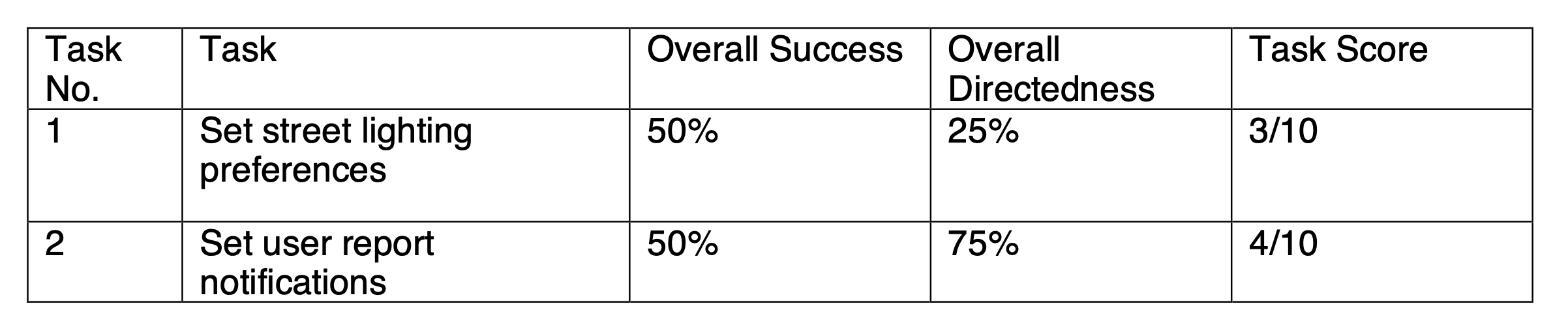
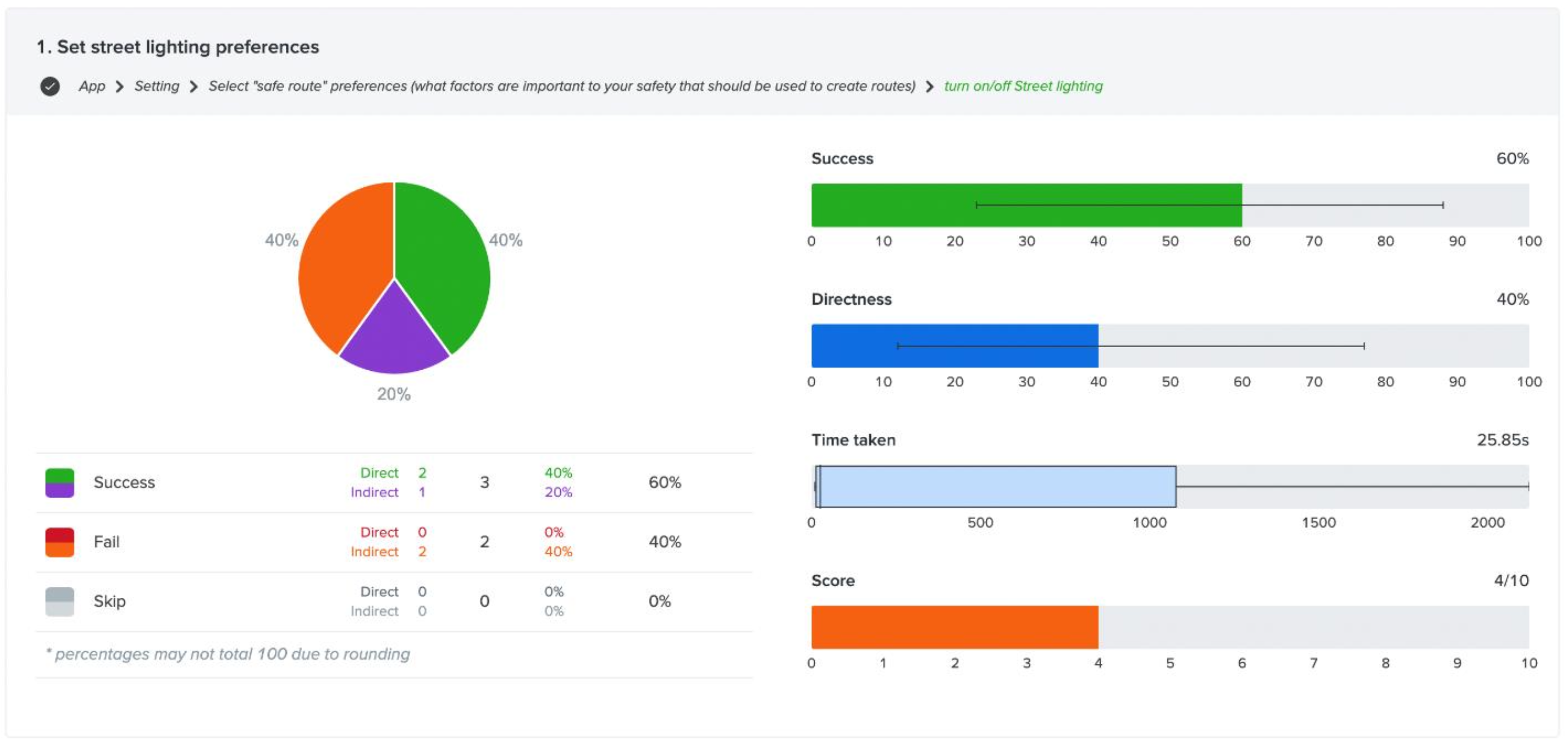
Appendix E—Treejack Set Up and Testing Analysis
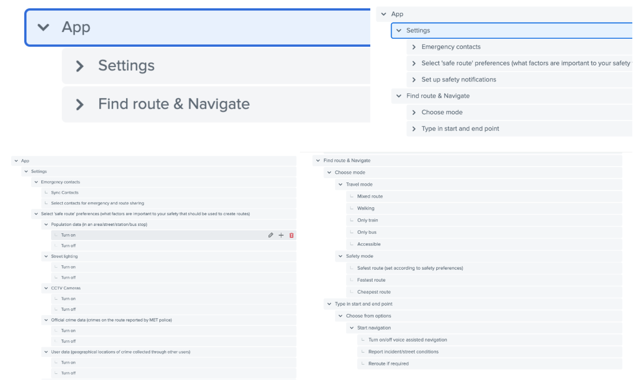
Task 1: Set street lighting preferences
This task’s flow was App > Setting > Select "safe route" preferences (what factors are important to your safety that should be used to create routes) > turn on/off Street lighting
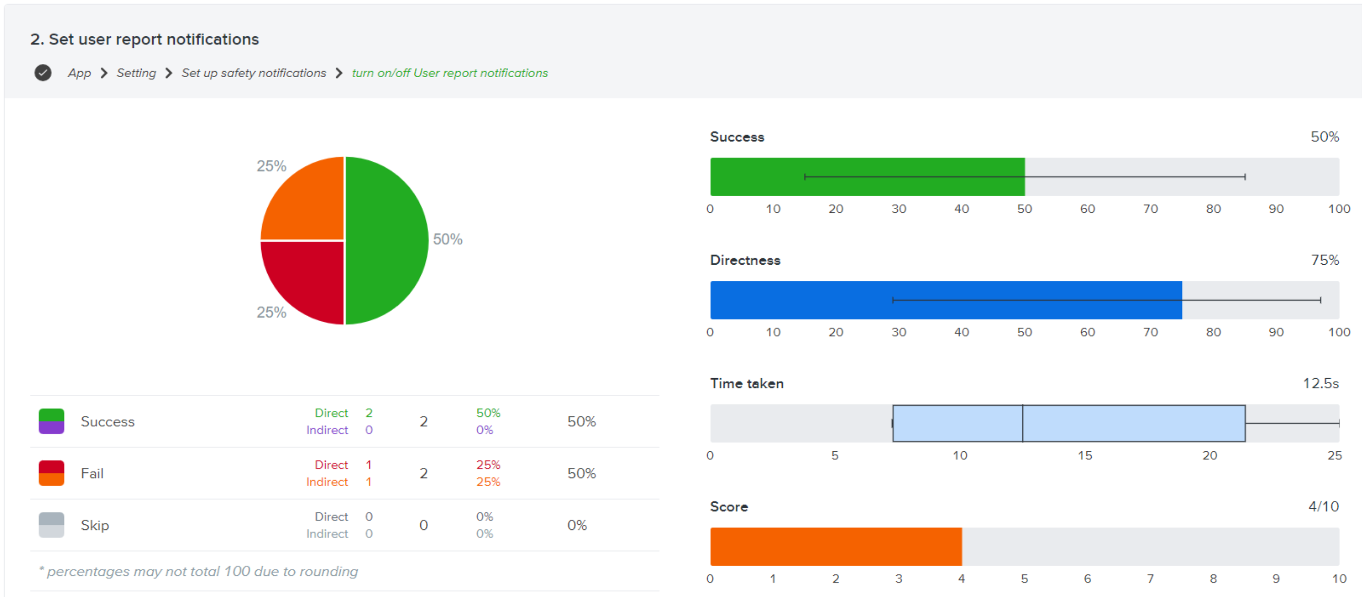
Task 2: Set user report notifications
This task’s flow was App > Setting > Set up safety notifications > turn on/off User report notifications
Tasks overview
Appendix F—‘Prototype 1’ First Click Test: Set Up & Result
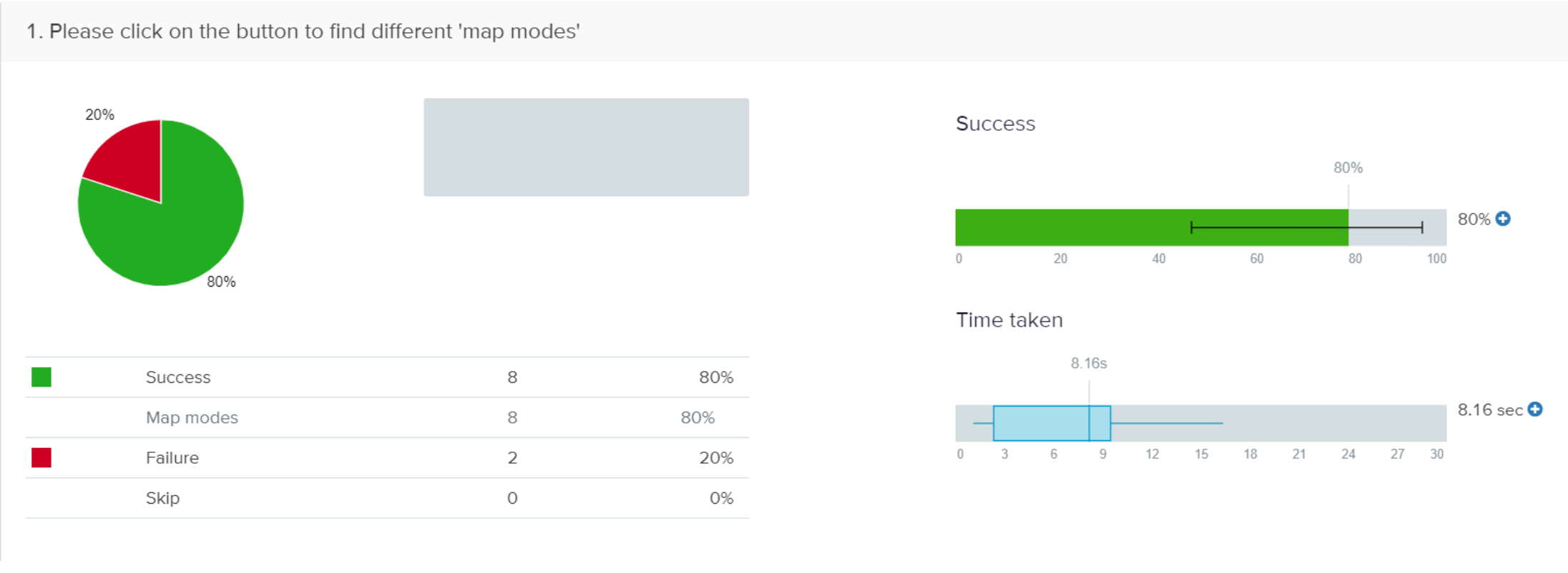
Task 1: Please click on the button to find different 'map modes'
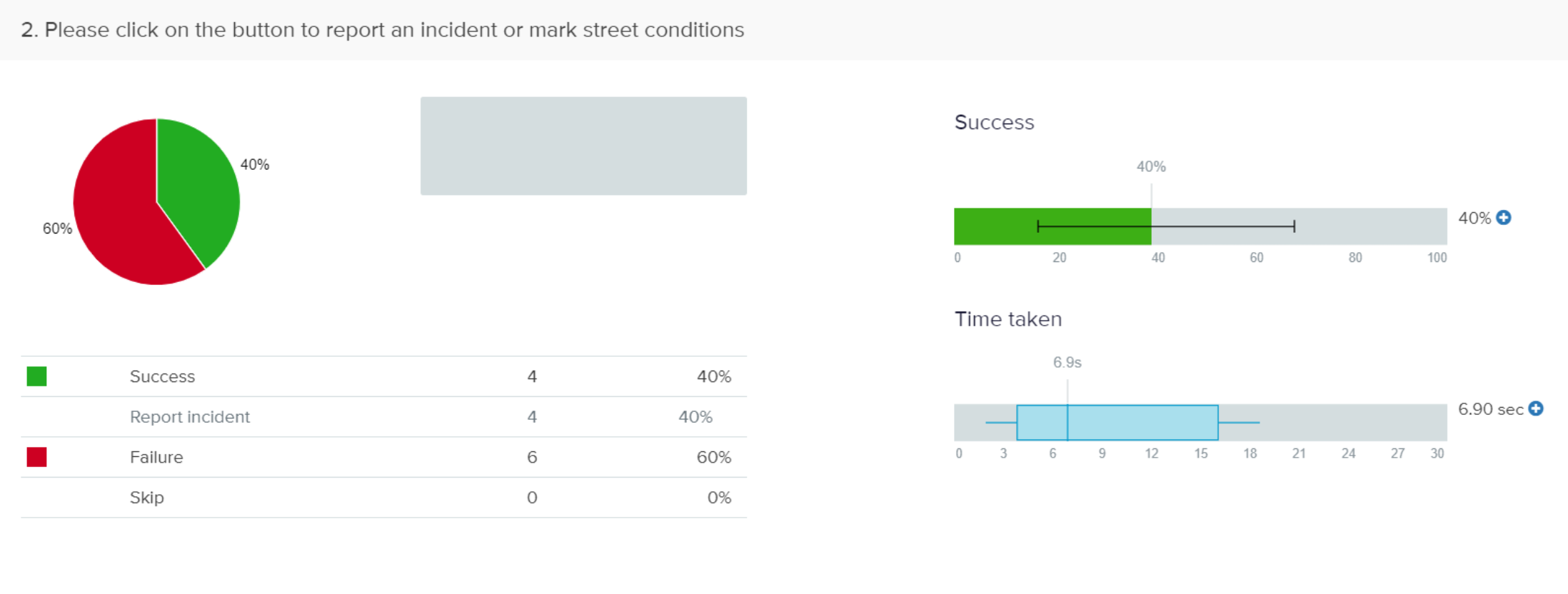
Task 2: Please click on the button to report an incident or mark street conditions

Task 1: Please click on the button to find different 'map modes'
This task had 80% success and 20% failure. Most of the participants were able to guess where they would find this option. The average time taken to complete this task was 8.16 seconds. The heat map shows where the participants found the option—“map modes”. Out of 10 clicks, 8 clicks were successful.
Task 2: Please click on the button to report an incident or mark street conditions
In this task there was 40% success and 60% failure. This should be because of a new feature when it comes to a navigation map and so people aren’t used to it. The average time taken to complete this task is 6.90 seconds. The heat map shows the places where the participants would find this option. This task had 4 successful clicks out of 10 clicks.
Appendix G—‘Prototype 1’ Exploratory Test & Results
Find ’Prototype 1’ test result sheet here: IS—Prototype 1—Test Results
Appendix H—‘Prototype 2’ Improvements
Based on the eight heuristic principles and feedback from ‘Protoype 1’ testing the following improvements were made:-
- Based on real-life scenarios and existing map, the shown information in navigation preview, route selection, and navigation have been improved so that the user can focus more on navigation.
- Colours were added for journey details (tube symbols etc.)
- Colours were added to the start button, SOS function, and alerts for higher recognisability
- Improved notification and alert function by highlighting it at the top and automatically popping up reminders when user is navigating.
- The missing basic functions include returning, checking, etc.
- Regulation the best way to switch on/off mute, with a suggestion
- Map Layering explained
- The rating and feedback content changed after arriving the destination, add some options for positive feedback
- Modification on placements and edited some of the icons , including “layering” and “end point” button.
Appendix I—Consent and Privacy Statements
Visual Prototype
Hello! We are conducting this Usability test for a prototype of a mobile application that provides navigation based on safety metrics to identify safer routes for night time navigation. We hope to gain insight into various aspects of the app function and design. You will be given a set of tasks to complete on the app, and we will ask you questions about any challenges and feedback you have about them. Your verbal feedback will be collected through notetaking and your behaviours during the test will be observed and noted.
All the data collected from this study will be used for the sole purpose of research to design this solution and will not be shared with any other parties outside this group (Chenyang Zhou, Evangeline Rex Shiny, Meghana Thakkar, Volany Falerio, and Yuan Chen). The esults of this study will be presented in a report to be assessed by faculty at Goldsmiths University of London, but all personal data will be coded, and you will remain anonymous. Please feel free to ask any questions you may have about your data privacy for this study.
You are also free to leave or end the study at any point you feel like and do not need to provide a reason. Do you consent to this study?
Thank you for your participation! Shall we proceed?
Voice Assistance Prototype
Hello! We are conducting this experiment to test two different methods of voice-assisted navigation to inform the design of a mobile application that provides navigation based on safety metrics to identify safer routes for nighttime navigation. We hope to gain insight into which type of instruction is most effective for voice-assisted navigation You will be given two tasks which involve walking from point A to point B for 10 minutes and point B to point C for approximately 10 minutes, using the different voice-assisted navigation methods. For one of the tasks you will use Google Maps voice assistant for navigation, and for the other one a member of our team (Meghana Thakkar) will give you directions over a phone call. For both tasks, you will be required to use earphones/headphones and rely solely on the voice directions provided to you. Your tasks will be timed and your verbal feedback will be collected through notetaking after both tasks have been completed.
All the data collected from this study will be used for the sole purpose of research to design this solution and will not be shared with any other parties outside this group (Chenyang Zhou, Evangeline Rex Shiny, Meghana Thakkar, Volany Falerio, and Yuan Chen). The esults of this study will be presented in a report to be assessed by faculty at Goldsmiths University of London, but all personal data will be coded, and you will remain anonymous. Please feel free to ask any questions you may have about your data privacy for this study.
You are also free to leave or end the study at any point you feel like and do not need to provide a reason. Do you consent to this study?
Thank you for your participation! Shall we proceed?
Appendix J—Experimental Result Details
Visual Prototype
Task 1: Input route and select the preferred option based on safety metrics shown for each route
Instruction: Imagine you are walking back home after a late day at work/college and want to find a quick but well-lit route home?
- Is the information provided with the route options clear and sufficient to help you choose the best route to go home?
- Participant W: I like the idea of showing all this information. The icons are confusing and require some explanation as I have never used this kind of application (referring to the safety metrics icons)
- Participant X: I think so
- Participant Y: Yeah, I think I can decide pretty quickly which one to choose.
- Participant Z: I understand what is shown but I’m not sure it’s detailed enough. Like how do I know exactly what the condition of the route is; like how many CCTV cameras are on the route and where they are? Maybe it would be good to see them on the map before.
- Did you understand the logistical information provided about the different routes including estimated time, and transport methods? Do you find it helpful and sufficient?
- Participant W: Yeah that stuff is easy to understand. It’s like in Citymapper’s but maybe with some changes
- Participant X: I think it’s clear and easy to understand
- Participant Y: It was pretty simple and clear so yeah.
- Participant Z: It was good I think, followed the standards and gave all the required information
- Did you understand the safety metrics provided for each of the route options and the reason for the recommended route? Were you happy with the information provided?
- Participant W: The icons are a little unfamiliar and I don’t remember what the sign one means (referring to the ‘avoid quiet path’ icon) but the light and camera one is clear.
- Participant X: Yeah it’s clear to see how the routes are recommended, not sure if I would find all the metrics important. Like CCTV cameras may not be working or something.
- Participant Y: I like the simple information, but maybe the icons could be more prominent?
- Participant Z: I mean I guess the safety stuff is clear, but I don’t understand the options together. How do I see about the different transport choices and safety info? Like I don’t get how they are working together as such. But I guess there are always lots of route options, so maybe to decide fast this is okay.
- Did you face any challenges during the route input & selection process? If yes, what were they?
- Participant W: I think it was fine overall. I like the whole idea to show this information for mapping. I guess just the icons could be more clear as I said before.
- Participant X: I don’t think so, the information was clear
- Participant Y: Its mostly good I think
- Participant Z: I like the overall concept and flow. But apart from the stuff I mentioned, I think it would be good to have a fast way to go from the travel details to the selection part. I have the same problem when I’m using Maps (Google) as well when I want to see things fast, I have to click so many times, its so frustrating! I don’t know how it can be done better, but yeah, I think that could be something helpful to save time.
Task 2: Share the selected route with an emergency contact after clicking the ‘start button’.
- Was it intuitive to find and access?
- Participant W: Yes
- Participant X: It was easy to find it
- Participant Y: I think its a good place for the button because its with the instructions
- Participant Z: Yeah its easy to find, but why can’t I share it before I start the map?
- Was the ‘share route’ feature efficient and easy to use?
- Participant W: Yeah it was quite easy to find. I like the option of sharing the actual route with someone!
- Participant X: Yes. The sharing route was good and simple.
- Participant Y: Yes, its helpful and clear
- Participant Z: Its super easy to use, its like sharing other things on apps.
Task 3: Explore and view the different map layers/modes
Instruction: Try to understand the population data and presence of CCTV cameras in the selected map area using the zoom in and out ability on the map
- Was it easy to find and navigate the application of layers on the map?
- Participant W: The layers icon is similar to Google so it was pretty easy to find, but not easy to switch, i thought I had to ‘cancel’ to come out and the thing ended so I had to start everything again.
- Participant X: I’m not sure, I can understand where to find it by process of elimination, but I wouldn’t know to look for it, you know?
- Participant Y: Yes, it's in a good position but maybe can be highlighted somehow because it can be important information. Also when I wanted to come out of that view, I clicked on the ‘x’ button and it took me out of the navigation completely. So that was very confusing.
- Participant Z: I think it’s easy to find intuitively but can be made more prominent. Also, would like to see the layers before (starting navigation) as well.
- Was it easy to understand the data shown on the different layers of the map (CCTV cameras, and population data)?
- Participant W: It was okay for the most part, could be nice to see the data together
- Participant X: It was easy to understand the data for the map layers
- Participant Y: Yes but maybe different types of colours can make the data clearer.
- Participant Z: It was easy to understand. Might prefer cleaner colour separation and seeing the data on the entire map area. Also maybe it should be easier to switch between the modes instead of having to open the button again and again.
- Did you face any challenges while viewing or understanding the data shown on the layered maps? If yes, then what were they?
- Participant W: Not really.
- Participant X: No I don’t think so
- Participant Y: It could be better if you see all the data at once as an option
- Participant Z: I think I mentioned everything. Seeing all the layers together can also be thing?
Task 4: Explore the navigation function
Instruction: Imagine you are walking on a street at night trying to get home and you receive an alert at some point during your journey before you reach your destination. Start navigation, view and close the alert, end navigation and provide feedback.
- Did you find the alert function to be distracting?
- Participant W: I don’t think so, it doesn’t seem like it would cause interruption
- Participant X: For me it was not distracting.
- Participant Y: No, definitely not distracting, which is sometimes the case with other apps.
- Participant Z: It’s fine, personally, I would not really look at the map while walking at night so I would need some other way to be alerted.
- Did you find the alert to be insufficient?
- Participant W: No it seems good
- Participant X: No I think it’s highlighted enough
- Participant Y: I prefer low distraction, but since it’s not coming in the way of navigation it can be more prominent
- Participant Z: Not sure, really, maybe. For me, like I said I would need some other type of alert
- Did you face any challenges while reacting to the alert on the screen? If yes, what were they?
- Participant W: I think its fine to swipe it in and out, easy.
- Participant X: Nothing apart from the fact that it should be brighter or something
- Participant Y: Swiping at night could be difficult, but its fine because it’s not really interfering with the instructions
- Participant Z: No not really
- Any additional comments on the navigation function?
- Participant W: The end navigation button was confusing to locate
- Participant X: No not really
- Participant Y: Closing navigation was hard to find, like I said, I thought it was to cancel the map mode view at some point.
- Participant Z: Nope, I think it’s fine
Post-test questions
- Did you find the application easy to navigate? If no, then why?
- Participant W: Yes
- Participant X: Overall, it was fine
- Participant Y: Moving through the application was quite standard so it's good
- Participant Z: Largely the navigation was good, just the stuff about going back and forth in the route selection and layers process can be improved
- Did you find the UI to be pleasant or harsh on the eye at night?
- Participant W: I prefer the dark mode UI so for me it was good
- Participant X: I think some important functions can be highlighted more, but the UI is good and intuitive
- Participant Y: It was quite easy to read at night, didn’t hurt the eye
- Participant Z: I’m used to using the light mode for apps so that option would be nice if I’m checking the route indoors or something, but the dark mode is also easy to look at
- Did you like the UI? If no, then why? Please mention any thoughts about the UI
- Participant W: I liked it. The minimal design is good
- Participant X: I think some important functions can be highlighted more, but the UI is good and intuitive
- Participant Y: The overall UI is good but would prefer some more colour to make things clearer
- Participant Z: The UI is quite familiar, except the layer colours, but generally the aesthetic is good.
- Do you have any additional comments or suggestions?
- Participant W: I liked the feedback function
- Participant X: I like the concept and would be useful to me
- Participant Y: The idea is good, but I think I would really have to trust the data and stuff
- Participant Z: I think the safety space is very important for women especially, so I think it’s a good product to explore. Apart from that, I think I’ve said all the suggestions!
Voice-assisted Navigation
Time-taken (rounded up/down to 10 seconds)
A. Only distance-based instruction
- Participant W: 9 mintues 40 seconds
- Participant X: 11 minutes 20 seconds
- Participant Y: 9 minutes 30 seconds
- Participant Z: 12 minutes 20 seconds
B. Colloquial + distance-based instruction
- Participant W: 9 minutes 30 seconds
- Participant X: 11 minutes 40 seconds
- Participant Y: 8 minutes 40 seconds
- Participant Z: 12 minutes 40 seconds
Post-experiment interview questions:
- In which of the two tasks were the voice directions easier to follow? Or did not make a difference?
- Participant W: They were both pretty easy to follow
- Participant X: Both were good, but its nice to have the extra information (B)
- Participant Y: I for sure prefer the second one (B) because like that’s how people give directions
- Participant Z: I guess I was pretty confident with both
- In which of the two tasks did you feel more confident in the directions you had to take?
- Participant W: I think knowing how many turns gives (B) me more confidence because I’m always worried about the lag in Google Maps
- Participant X: The extra information in the first one (B) makes me more sure of the direction
- Participant Y: I prefer the second one (B) So I wasn’t really thinking about the distance information.
- Participant Z: They were both fine, I guess I was also very focused on traffic, maybe late at night it would be different
- Did either of the task directions make you feel overwhelmed?
- Participant W: Not really
- Participant X: I worry about the lag mostly and how long the map take to give directions. But in some cases it can also be annoying to hear the same directions many times. It needs to be balanced.
- Participant Y: With longer street names both scenarios can be irritating
- Participant Z: Not particularly, I worry about having to count the streets as I go though, so maybe I wouldn’t want to do that
- Do you have any other comments?
- Participant W: No
- Participant X: Fix the lag! But yeah, the idea seems good but maybe it needs to be more detailed
- Participant Y: I really like the concept of these kind of directions. If I had those then I wouldn’t really need the distance directions while walking. Just an alert when I do have to turn
- Participant Z: Not sure about the idea, maybe it needs more work?
Appendix K—Contribution
- Chenyang Zhuo—Field Study, Iteration, Persona, Wireframes, Prototypes Making
- Evangeline Shiny Rex—Field study, User story board, brainstorm concept sketches, final wireframe sketches, appendices content
- Meghana Thakkar—Wireframing, supervision, written report, formatting, data curation, conceptualization, appendices content and organization, interviews
- Volany Faleiro—Double diamond process, Research objectives, Competitive review, Mind Map, User flow diagrams, Sketches, Prototype instructions.
- Yuan Chen - Wire-framing, user journey map, lo-fi page and interactive production, high-fidelity page production.