The ATSA Report
The ATSA (ART Think South Asia) report documents the outcomes of an art residency programme hosted by Khoj. The report was developed to reflect the programme’s interdisciplinary, process-driven nature while remaining accessible and engaging across diverse content types
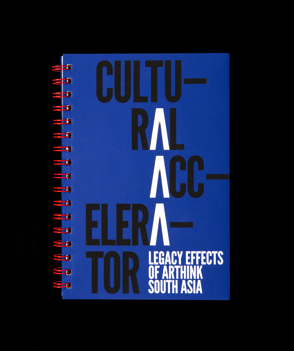
Cover concept
The title design aligns and emphasises the repeating 'A's in Cultural Accelerator to evoke momentum. Die-cut 'A's on the cover reveal a mirrored white page inside, reinforcing the theme of acceleration and collective energy.

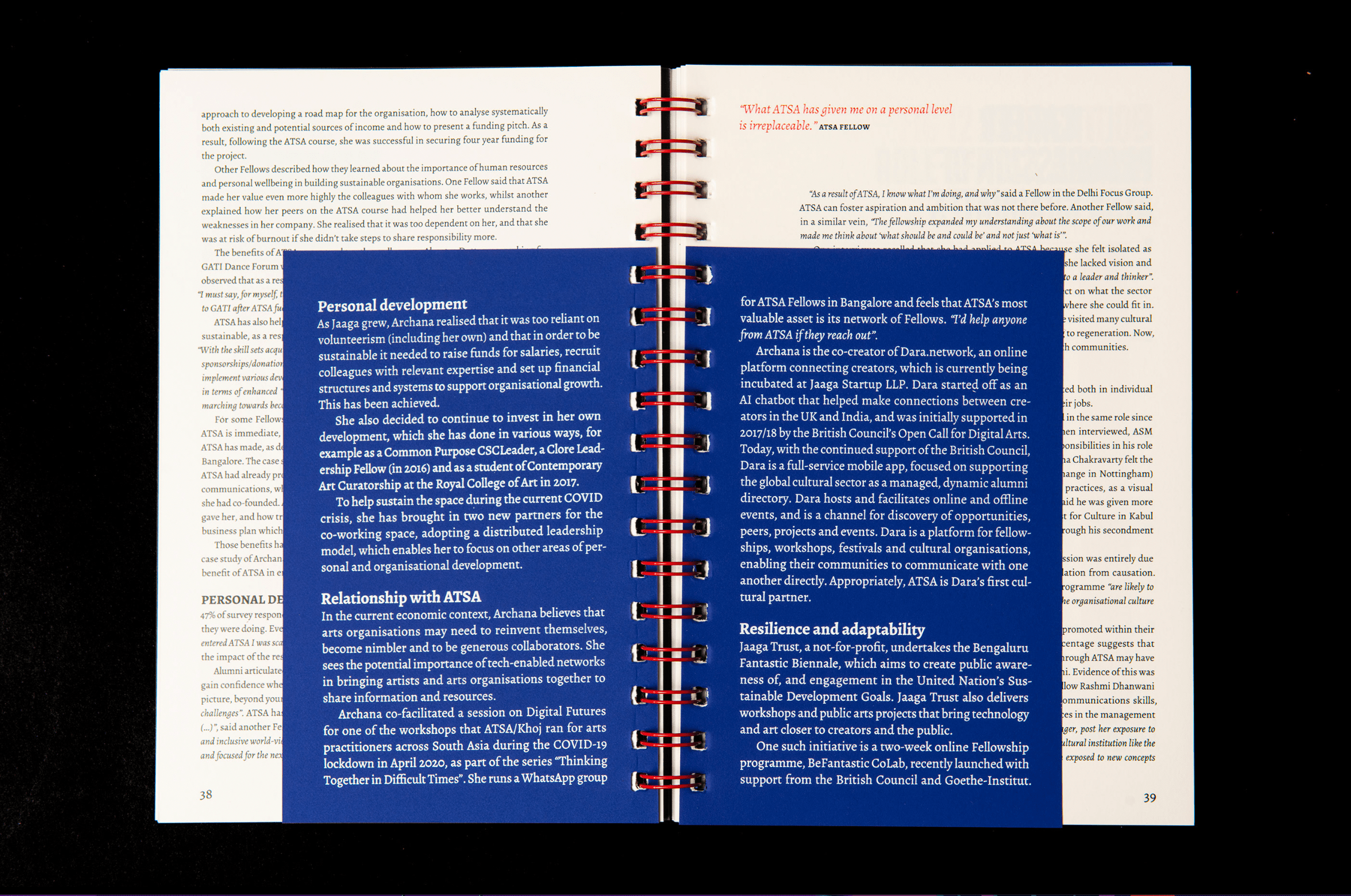
Wire Binding as Conceptual and Practical Choice
The report is bound using a stark red wire bind—a decision made for both cost-efficiency and layout flexibility. It visually reflects the infrastructural focus of the programme, while allowing for varied page sizes and sequencing within the publication.


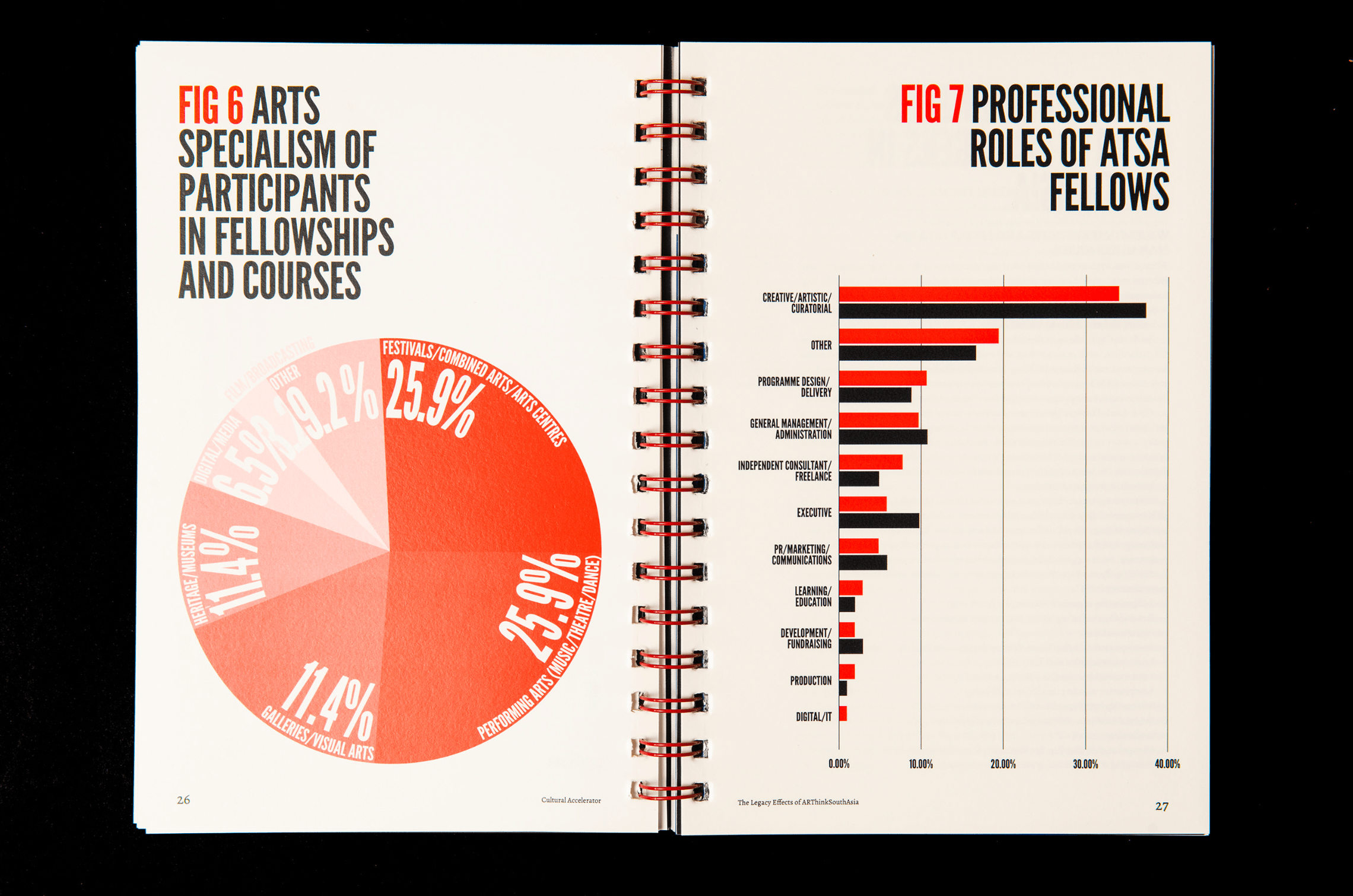
Colour & Visual Energy
A vivid red is used consistently to inject urgency and energy throughout the report. This bold colour helps break the monotony of dense text and visually connects sections across a modular layout.
Flexible Layout Structure
Different types of content are introduced through varying page sizes and formats, allowing the reader to distinguish between essays, reflections, data, and artwork. This creates a physical rhythm that mirrors the programme’s layered, multifaceted approach.


Throughout the report, all-caps typography in red and black maintains visual intensity and consistency. Black full-bleed chapter openers serve as typographic pauses—marking clear transitions and grounding the reading experience—while maintaining the bold editorial tone. The typographic system ensures clarity, impact, and rhythm, mirroring the report’s critical and cultural urgency.